 To begin, let me say that I just love photographing stained glass windows.
The vibrant colors created as the light plays through some phenomenal artist's work inspires me. I am humbled that I can only capture his talent, not produce it.
There are a great many 19th century churches in Buffalo, NY - housing some of the finest stained glass creations anywhere in the world, One by the original creator of the chemically treated glass coloring process himself, Louis Comfort Tiffany.
You may have heard of Tiffany glass? Imagine how expensive an entire church wall of Tiffany Glass would be. Unimaginable. Priceless.
But in reality, the stained glass windows in churches, while beautiful to behold, are not as well suited to decorate the more traditional walls in my own home. This leads me to the illusive hunt for more secular stained glass. Something that can be used to brighten any room in the house.
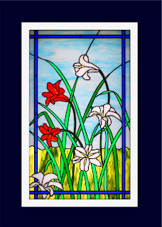
This is one of my favorite's here. I discovered ths bright and cheerful garden scene in a most unlikely place... a cemetery.
And that leads me to today's Photoshop tip.
Getting maximum impact "PoP" from the colors in your photographs.
Often times, folks use lightness or brightness to try to make the colors more vivid. But that only tends to wash out the whole image. While the colors may seem brighter, they lack the 'pop'.
It can be confusing, what with options like COLOR BALANCE, BRIGHTNESS/CONTRAST, HUE/SATURATION and SELECTIVE COLOR. While these options are all useful in their appropriate places, only one is best suited to improving the overall color pop across the entire photograph.
For adding overall color 'pop'...think SATURATION. You're going to saturate your photo with color pixels until they can just barely hold any more without bursting.
To do this go to LAYER - NEW ADJUSTMENT LAYER - HUE/SATURATION
Using only the center SATURATION slider you will find that moving the slider all the way to the left turns your photo to black and white (remember this as an easy way to create a b/w image ...and also a great way to create those images of the b/w bride who is holding the brightly colored red bouquet. You need to add a layer mask for that. I'll cover it another time, or if you can't wait it can be found in the Photoshop Tip Cards)
So, moving the SATURATION slider left reduces the color intensity. Conversely, moving the slider right increases the saturation, ie. adds more color 'pop'. It doesn't take much either. Up to +10 usually is sufficient to add pop without noticeably changing your colors. Get beyond +10 and you may start changing your colors in ways that are unattractive.
When you think bolder color, think SATURATION.
And if you need to add just a bit more 'POP', don't go for the lightness or brightness sliders, try increasing the CONTRAST instead.
Side note. If you consistantly find yourself having to increase the saturation because you are not pleased with the output from your digital camera, you may need to consult your owners manual.
Most cameras (including my favorite Nikon) have adjustment for image color and saturation in the custom settings mode. I leave the color mode at its default setting, but crank the saturation to its highest level.
Photoshop saturation...soaking the pixels with vibrant color.


No comments:
Post a Comment