Monday, December 28, 2009

Blending Layers

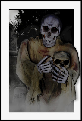
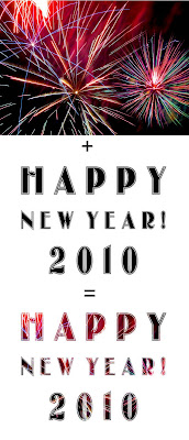
As the current year nears it's seamless blend with the next, it reminds me of a useful Photoshop tip. Imagine that.

Often times we'd like to superimpose an image over some object, shape or text. This can add lots of pizazz to an otherwise ordinary image. Text is always one item that benefits greatly from this technique.

So how do we do it?

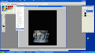
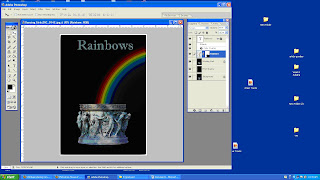
It takes two to tango and it takes two layers for this technique. The image or photo you want to superimpose over the text should be on the higher layer with the text layer just below.

Once you have your two layers in place, hold down the Alt key and put your cursor on the line between the two layers on your layers palette. Your cursor will turn into two overlapping circles with an arrow. A simple Left click on the mouse completes the equation.

Works to superimpose over text or shape objects in their natural state. This technique will not work however, if those layers have been rasterized.

Here's hoping that as 2009 blends seamlessly into 2010, you will be adding yet another wonderful layer to your life.

Happy New Year!

Monday, December 14, 2009

Something Else You Can Do With Photoshop

Photoshop is excellent for turning not-so-good photos into good ones, and for making good photos great.

And that's a great use of the software. But it can be used for so much more!


Business cards, promotional flyers, ads, greeting cards, or you can create, complete digital books for online viewing or purchase and/or hardcover printed books.

I invite you to take a look at what's possible when you begin to think creatively about your Photoshop skills.

Recently, I designed a children's book using only Photoshop. I used LEGO toy scenes which portrayed prosperity quotes from the masters.

Each scene was built using the colorful LEGO toy pieces. Once built to give visual representation and easier understanding for kids, the scenes were photographed and the actual text of the quotation was overlayed. One page from the book, which is especially appropriate for the holiday season, is shown here on this post .

There are over 105 inspirational, motivation, educational tips in all.

And though it's built as a children's book, parents read and learn as well! Special moments are created you're reading it together with your kids!

You can get more details about this book at:

http://helpbobhelpkids.com

But I digress!
No surprise there!

There are templates, far too numerous to mention, which can be very helpful in putting together the media you need, whether it be business cards, note pads, promotional flyers, ads, photo books, etc.

Vistaprint has many templates available for use, even if you only use them as templates for design. You don't have to buy your finished product there. I have used them many times and always find they produce and deliver as promised.

Previously I did 90% of my work in Microsoft Publisher and 10% in Photoshop. Now I'd say it has flipped to 90% in Photoshop and 10% in Publisher. And I loved Microsoft Publisher. Still do. But adding the photo element to your designs really makes them stand out.

Or should I say, outstanding!

So next time you need stationery of one kind or another, or just feel the urge to create something unique and wild, like a book...

Consider giving Photoshop the business!

Since it is the season of giving I offer two Photoshop Tips

1. Remember to fully explore the menu options.
~ Open all the
brush palettes by clicking on that little, right pointing arrow at the top of the brushes box.
~ Explore all the different gradient choices the same way.

Just 10 minutes spent each time you open PS, exploring new menus, will give so much added dimension and interest to your work.

2. Here's one I used a ton while making the book...
Have you ever dragged an image from one photo to another, only to find that the dragged photo opened so, so big on your workspace? And then you wanted to used EDIT-TRANSFORM to shrink it down but it was SOOOO BIG you couldn't find the handles or guides to shrink it?

Here's the trick!
Anytime you have selected a function which involves moving your layer, you can use the keyboard shortcut Ctrl-0 (that's "control-zero"). PS will automatically reduce the size of your images to allow you to find the handles.

That's it for today!

Happy Holidays to Everyone!

Robert Schwarztrauber

PS: The holiday stress can often bring us down.
If you find you need a bit of inspiration or motivation be sure to check
out my new book and the special promo which runs through Dec.24th.
Here's the link again:
http://helpbobhelpkids.com

or you could visit my new blog for the book...


Until next time...Let's go Photoshop something!
Have a Happy and Safe Holiday Season!

Tuesday, October 27, 2009

Shortcuts Are Less Scary

Photoshop can be a lot less scary to work with and a whole lot faster to use when you know a few simple shortcuts.

Here are some commonly used keyboard shortcuts that are frighteningly simple to apply:

Alt-Backspace: will fill any layer completely with the foreground color shown on the pallet

Ctrl-Backspace: will fill any layer completely with the background color shown on the pallet

Alt-Shift-Backspace: will fill any pixel area with the foreground color...great if you've just drawn a shape with the marquee tool or selected a figure with the lasso tool. Could be useful for creating shadows too!

Ctrl-Shift-Backspace: will fill any pixel area with the background color.

And how about two useful text tips...

1. Say you've just created a line of text, but it's not positioned where you want it. You don't need to go out to the Move Tool (arrow). Simply grab the mouse and move the cursor away from your text.
Then, left click and drag your text to wherever you like.

2. You've positioned the text where you want it, but now you don't like the color. No problem. Simply move your cursor to the beginning or end of your text line, left click the mouse and drag across your text to highlight it. Now you can go up to the toolbar and click on colors to alter the one shown on screen.

OK, that's not really big news. But if you found it frustrating that you couldn't SEE the new color you selected because of the highlighting, stay tuned! I have a nice keyboard shortcut for you that will save you time and aggravation.

Press, Ctrl-H to temporarily turn off the visual highlighter so you can SEE your true text color.

That's all for today. See, nothing to be afraid of.

When you have a guide to walk you down the creepy dark corridors of Photoshop, it can actually be kind of fun! Let Photoshop Tip Cards be your great BIG FLASHLIGHT, lighting your path through the scary maze that Photoshop can become.

Tuesday, September 22, 2009

3 Second Fix for Layers

In the previous post I promised to give you a quick, 3 second fix for changing layers that you drag over to create a composite photo.

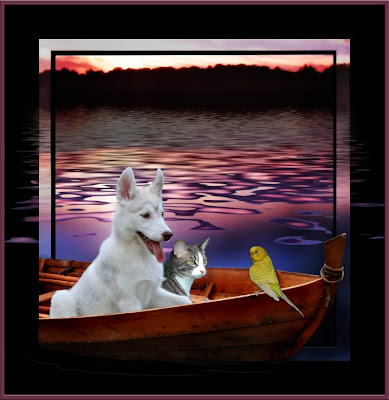
Take this photo...please! :)

This was composed of many separate base layers: the 1.dog, 2.the cat, 3.the bird, 4.the sunset over lake background, (one of Scott's, NewPhotoBiz backgrounds) 5.the waves, 6.transparent inner frame, 7.black inner mat...and more.

Getting all those layers to match in terms of color, lighting, texture, etc. can often be a hassle. But with this quick and easy way to adjust one layer, without effecting all the others, your work will be much simpler.

Like most things Photoshop, there are many, many paths one may take to reach the desired end result.

But here is my quick, 3 second fix for layers that that just don't fit. Fit well with the other layers that is.

Rather than do something destructive to the layers you drag in, one of the simplest ways to alter just one layer in your composite starts with duplicating the layer (shortcut, hold down "Ctrl" key plus the letter "J" or Ctrl-J)

Then, change the blend mode on your new, duplicated layer from "Normal" to say, "Overlay" or "Softlight" From there adjust the Opacity of that layer to lighten or darken your subject on just that layer. That's a really quick way to lighten or darken your dragged-in subject to match the surrounding scene -without effecting any of the other layers.

Of course you can also use any of the other layer adjustments too. Filters, lighting styles, blur, you name it.

When you've got it looking just right, you have two options. Leave it just as it is, on two layers.
Or, if you can stand commitment, merge the two layers together. Merge IS advised if you feel you are going to be moving things around. Otherwise, it may be hard to get the original layer and the duplicate lined up later. Certainly, if you don't want to commit and merge them together, you could LINK them together so they move in tandem.

Sunday, September 20, 2009

Save Big Time with Cut-Outs

Unfortunately, we can't always get our subjects and our scenes in the same place at the same time.

Thankfully, we have Photoshop to fix that problem!

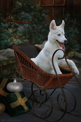
Case in point, my daughter's husky puppy looks just adorable with this sleigh (from NewPhotoBiz 1.0). Sitting in, rather than pulling it!

Originally, the puppy was photographed outdoors, in the backyard. The background was green grass and bushes.

The challenge was to remove said dog from the green grass to create a clean image that could be transferred to this sleigh scene.

If you've ever tried to cut fur from grass cleanly I know you're going to love this tip. A tip I got from Scott Voelker, creator of the NewPhotoBiz 1.0 program.

(Click On Photo Above for a Better View of Details)

Here it is...use the background eraser tool. The key is to set the parameters. Here's what I use:

Protect Foreground Color...check the box, this allows the eraser tool to cut out (delete, erase) anything that is not the color you select. In this case, I would use the eyedropper to click on an area of white fur to set the foreground color (protection). Sometimes, depending on your lighting and subject, you'll need to keep changing the foreground color you're protecting as you move around your subject. Like here when I cut around her pink tongue, I had to reset my foreground color to match her tongue, rather than her white fur. Then, once past, I returned the foreground color to white to protect her fur.

Tolerance. I set mine here at 50%. This tells PS how close to your foreground color it must protect. Since the fur color does vary a bit in white colors, but is very different from the green grass I want to erase, 50% worked well. However, if you're trying to cut out say a girls green dress from green grass, you might want to work with (set) a little less tolerance, say only a 10% tolerance (or variation) so PS doesn't confuse the grass with the dress and accidentally erase the dress too. Test, use "undo" to go back if you find it's erasing more than you want it to.

Limits. This will depend a lot on what you're working on. For fine detailed cutting in a photo where the colors vary greatly as in this puppy example, FIND EDGES will likely work best. If you have a lot of solid colors, perhaps Contiguous (connected) of Discontiguous (separated) might be faster for you

Sampling. In cutting out hair (or fur) I find that setting it to ONCE works best. Set it to the hair color and work around your subject.

Once you have your parameters set, chose a brush that works best for your situation, I usually start with a feathered brush, and start mouse-clicking that brush around the edges of your subject. If you've done it right, like magic it erases everything from around your subject, yet leaves even the finest hairs and whiskers! You might have to go around again to catch any stubborn areas, or use one of those spikey brushes to get into awkward areas.

Coming Next...Ever drag a subject from one photo into another and then wish you could change something about that layer. Maybe it's too light, too dark, not sharp enough. But you don't want to damage it, or go back to your original to fix it then move it back over?

Quick 3 second fix...next post!

Monday, September 7, 2009

Free Tips, Free Cards, Free-For-All!

Happy Labor Day!

I hope today finds you celebrating Labor Day by not doing much labor!

But instead, having FUN!

Today I want to help you do less work, Photoshop-wise, by giving you time-saving, work-saving tips.

Just a few short tips because I want time off too! And you don't want to spend all your time reading and trying to do difficult stuff today.

So here we go!

Text Tip #1... Normally when you click on the text icon (T), once you start typing a new layer is created. But if you're doing multiple text layers, often you start typing on an old layer where you didn't intend to.

Hold down the SHIFT key while you click on the T to guarantee you'll get a new text layer every time.

Text Tip #2... You often want to see several Font options before you select the one that's perfect for your project. The easiest way to do this is...

Type your text, highlight it, click in the FONT description box on the tool bar to highlight that, then just use the UP/DOWN arrow keys. As you scroll through it will automatically be changing your text.

Catchlights...Need a quick fix for giving life to those "dead" eyes that have no catchlight reflection? In the brush palette choose STAR 14 pixel. It actually looks like a slice of pie. Perfect for adding that sparkle to lifeless eyes.

Open a new layer, choose white for the color, size your brush then click to apply over the eye. Choose a layer blend mode that looks best, (overlay?) vary the opacity and viola! You've got eyes that dazzle!

OK, I promised to keep it short so you (and I) can go play.

But stay with me for this SPECIAL ANNOUNCEMENT!

I know following this Labor Day, many folks will have no job to go back to tomorrow. Layoffs are at astronomical levels. Many folks are wishing they had someway to restore the income they once enjoyed, someway to take care of their families, protect their homes and their health.

If you are one of those people, I have great news! Since you're here I'm guessing you must be familiar with Photoshop. And that leads me to believe you have a camera.

The great news is you need just one more thing (it's not expensive) to create your own Photography Business!

You need Scott Voelker's NewPhotoBiz 1.0

It has everything you need, all the tips, tricks and secret shortcuts for creating a PROFITABLE photography business...this week! Best of all you can download it and get started TODAY!

But it gets even better! To help you along even more, when you click the links on this page to read more and then order NewPhotoBiz 1.0 I'll send you a FREE deck of Photoshop Tip Cards!


Yes...a FREE deck of Photoshop Tip Cards, 52 cards packed with the best and most popular Photoshop edits, tips, tricks and secret shorcuts. I want you to have every advantage as you claim your independence and begin to restore your finances. I want to help you grow your own business so you never again have to depend on some company or boss to toss you crumbs.

Labor for yourself now! Labor for your family! Labor at something that's FUN!

Create beautiful portraits of children and pets in your community. With Scott's program, you'll have everything you need. Including his secret weapon forum described in the previous post.

Remember, to get your FREE card deck, (a $19.95 savings) you must order NewPhotoBiz 1.0 by following the links from this page. That's the only way for me to be notified of your purchase by Clickbank so that I can send you your FREE cards. Click here now to get started.

Sunday, September 6, 2009

Get Paid to Play with Photoshop

It's so much fun creating images, we could just sit for hours and doodle away with our Photoshop tools.

(read in this article for a link to some cool water effects you can play with for free!)

But just imaging how great it would be if we could GET PAID to just sit for hours and doodle away with our Photoshop tools?

Well, now you can!

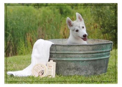
Actually, it's been almost a year now since Scott Voelker released the first product that makes it easy for ANYONE to create stunning images using Photoshop...and sell those images for BIG BUCKS...like the precious dog photo shown here.

I've mentioned his product many times before on my blog (one of the very few products I promote -because it's just so good). It's called NewPhotoBiz 1.0

It's more than just easy to use professional Photoshop templates that you can add your child and pet portraits into (saving yourself $1000's of dollars in props). Although that's a great way to seperate yourself from all the other photographers out there...and charge a lot more for your prints!

And it's more than a business-in-a-box (or now, a business-in-an- instant download!). Even though it contains a complete and proven system for new photographers to get customers.

Here's a little secret he doesn't tell you much about.

The number one thing stopping most amateur photographers from stepping up to the professional level and selling their photos for big profits, is FEAR.

Like most artistic types, we photographers are always asking, "Am I good enough?" "Is my photo really worth $1000?"

Well, not only does Scott give you the digital tools to be great, but his secret weapon is the forum he provides for those who purchase the NewPhotoBiz package.

And here's why that forum is worth far more than the modest cost of the NewPhotoBiz system.

Because it takes away the fear.

Wouldn't your confidence go through the roof if you could have professional photographers critique your images before you presented them to any customers?

And wouldn't your skills grow exponentially if those same professional photographers would offer you their years of experience, their tips, tricks and secret weapons for creating the best images ever, while never compromising your own unique style?

And wouldn't it be great if they did it for free? And how much better would it be if there were lots more "amateurs" there, just like you and you could watch and learn as they have their photos critiqued too? And you could get ideas about what the hot selling photos are. And you could get FREE marketing advice. Or you could just get someone to tell you you've created a really great photograph.

Now that's priceless.

While it's fine to sit and create fabulous images using Photoshop, I'll tell you from my own experience, it's much more fun to GET PAID to do it! When you get Scott Voelkers NewPhotoBiz you get everything you need to make that happen.

But even if you want nothing more than to create the most memorable images of your own children or pets, the modest cost of his program (which includes access to his secret weapon for vastly improving your photography skills...THE FORUM) Scott's program is easily worth 10 times what he charges. Because if you hired a photographer to create just one of the adorable images you can create with the NewPhotoBiz program, you'd easily pay him or her $1000 for just one big wall print.

When YOU get his program, you can create all the photos you want...at a fraction of that price!

Want to be a better photographer? Want to learn dozens and dozens of photography and Photoshop tips? Want to get professional critiques of your work?

Want to know if you're actually good...and how good?

Get the NewPhotoBiz program now and see for yourself... just click here!

Here's just one sample of the great information available when you participate.
It's a link I got from the forum moderator (for FREE!) along with a critique of one of my photos...it has really cool water effects you can add as filters in your Photoshop program.

http://www.flamingpear.com/flood.html

My best Photoshop tip for today is: Get someone to pay you to play!
And that's what you get (and more!) with Scott's NewPhotoBiz 1.0

Saturday, September 5, 2009

Cheapest Ring Light Ever!

While technically not a Photoshop tip, I am all about saving you time in your Photoshop edits. And it goes without saying that if you get the light right the first time you'll spend less time fixing it (or adding it) later in Photoshop.

Here in this diagram you'll see the amazingly simple and inexpensive ring light, made from 8 LEDs, that I used to photograph the strawberry in the color-change tip below.

All you need is a set of 10 LED lights that can be turned on continuously ($10+s/h) and a strip of adhesive velcro that wraps around your lens. ($3).

They provide an amazingly bright, even light that wraps around your subject. Really great for macro work. The tutorial said that the white balance might be weird, so I shot in RAW, but when I opened the files, I didn't need to make any color adjustments at all to compensate for the LED lights. (note: in the strawberry color change below, I did boost up the leaf color, yes, but that was because I already had bad color to begin with, not because of the LED light)

Here's a link to the cool website that showed me how to do it, and where to get the LEDs.
(another note: The website didn't say this but, the inexpensive LED supplier is in Honk Kong so, in my experience, it does about 10-14 days for delivery)

http://www.diyphotography.net/studio-at-home-introduction-to-led-lighting

Lots of other great tips there too...so take your time and browse around.

Consider adding these inexpensive LEDs to your camera bag. Used individually, as an additional spot light (highlighting the apple stem) or in groups like this ring light LEDs are
an inexpensive way to custom light your subjects. And so portable and lightweight too!

Let your imagination run wild!

And keep watching this week as I add more links to cool websites (other than my own!) where you can find great tips and inspiration. And more reasons to open up that Photoshop!

And don't forget to visit http://todaysphoto.org to view great scenes from photographers around the world...and get Rick's take on "The Original Photoshop Tip Cards".

Or for even more convenience, you can view TodaysPhoto.org right here at the bottom of this very blog page. Scroll down right now and check it out for your own self!

Easy Watermark Stamp

For maximum time savings it's important to automate as many repetitive actions as we can.

Watermarking, or copyright stamping our photos is one of those chores.

An easy way top automate this function is by creating a BRUSH that actually IS our watermark stamp.

Did you know you could create your own brushes? Not just for watermarking, but for painting or drawing or erasing with any shape you need and can create.

Basically, you use any of the text, shape or photo or drawing tools you wish, select any or all combinations with the marquee tool then choose EDIT-DEFINE BRUSH, choose a name for your creation and say "OK".

To begin, open Photoshop, go to FILE -NEW.
In the pop-up box be sure to check the box to make your background TRANSPARENT. (unless you want it with a white background, if so, then choose that option)

In this example for watermarking or copyright stamping photos, I chose the Copyright symbol from the shapes drawing icon, then added, on another later my name in Palace Script MT (strong).

I then merged the two layers together and used my rectangular MARQUEE tool to select everything together.

Once selected go to EDIT -DEFINE BRUSH. You'll get a pop-up box allowing you to name your new brush. Then, click "OK".

Now, whenever you want to apply a watermark to your photos, simply select your creation from the BRUSH pallete, (just like you would a round brush, but you'll have to scroll to the bottom of the list to find your new brush creation). Pick your brush color, and opacity, and flow then "CLICK" on your photo and like magic your signature stamp will appear.

Use the slider to adjust your signature size just like you would any other brush.

If you feel you want to tilt or make your selection vertical, simple create a new layer over your photo, stamp that with your brush then use EDIT-FREE TRANSFORM to position your brush or size it any way you like. If resizing this way, be sure to hold down the shift key as you resize to preserve the proportions.

Color Change -Quick and Easy 3 Step


Have you ever wanted to change the color of something in your photo, but not change the color of everything?

Here's some simple ways to do that and still maintain all highlights and other lighting characteristic of your subject.

In this example, the leaves needed a bit more color, but I certainly did not want to make everything greener!

First, select the area you wish to change using your favorite selection tool, ie. magic wand, lasso etc. However you do it, get those ants to dance around your selection.

Second, go to

LAYER-NEW ADJUSTMENT LAYER-HUE/SATURATION


...or, LAYER-NEW ADJUSTMENT LAYER-COLOR CHANGE

...or, LAYER-NEW ADJUSTMENT LAYER-SELECTIVE COLOR

Once you say "OK" to the pop-up box, the ants will disappear from around your selection but you will now have a masked layer (allowing changes to occur to only your selected subject).

Third...You may now begin to move the sliders until you achieve the color you wanted. You may also repeat the process (stacking layers), mix or match the color changing options, vary the opacity or lighting since each is on it's own separate adjustment layer.

Taking this a bit farther, you can see that by using the selection tool and LAYER-NEW ADJUSTMENT LAYER, you can selective change a zillion things about your selected subject (anything that comes up as an option under the NEW ADJUSTMENT LAYER).

Now that's a quick and easy 3 step!

Tuesday, August 25, 2009

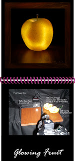
Glowing Your Own Produce

Yes, that's right! Not growing, but GLOWing your own fruits and veggies.

This fun project can keep you busy for hours. It starts with a trip to the grocery store to buy your subject material.

Begin with the end in mind. What we are going to do is hollow-out our fruit or veggie and then send the flash through it to create the effect of glowing shown here in this golden apple photo.


Apples of all colors work well. Peppers, oranges, eggplant work well too.

Anything with a colorful quality, with a firm and translucent outer skin could be a candidate. It should also be close to or larger in size than your speedlight.

A helpful tip if you are doing apples is to buy a lemon as well.
Apples quickly start to turn brown as you cut out the middle in preparation for the photo, but if you coat the inside with lemon juice it will help keep the apple white much longer. ( if brown it tints your flash-thru in an unpleasing way)

Once home, examine your fruit for its "best side". Next, plan your attack.

The inner fruit must be removed, hollowed-out, to clear the way for the flash to shine through and give it that glow.

In the example here I just cut the fruit in half to begin coring, then used two small pieces of Scotch tape to put it back together for shooting. Next time, I'll not cut in half, but rather have my cut lines at 10 o'clock and 2'oclock on the rear side to better hide the lines from the front camera angle. You may need to touch up a little in Photoshop if your seam or tape can be seen.

You don't have to be perfectly hollow, you don't want to puncture the skin on the photo side.

Once you have both pieces hollowed, take the rear half and cut a rectangular slot (1/2"wide by 1" tall) at the position where your speedlight can shine through as both the apple and flash rest on the table. If you're shooting something like a pepper that is mostly hollow already, you can skip the steps above and just start here with the slit in rear.

Next, place two pieces of gaffers tape over your speedlight to limit the flash to just the inside of your subject. Duct tape will work too. Drape some black material behind your scene (a simple sheet will do) and the set your subject on the table with the speedlight directly behind it. Masked slit to fruit slit. A wireless triggered speedlight offers more flexibility of camera position, but shown here is a basic wired version with camera on tripod.

Next set your focus and take a shot. Tweak.

You can play with the flash amounts, zoom in, zoom out. Higher or lower angle. Compare different surface materials for how they reflect the glow. If you're shooting in mixed lighting consider using camera RAW to more easily adjust the lighting later. The shot shown here was under florescent, normal room lighting.

However, when doing the apple I noticed the stem wasn't getting enough light. So I just spot-lighted it with the LED of my keyring!

Experiment! Be creative! Have fun!

Be sure to click on the photo above to better view details of the set up.

While I don't discuss shot set-ups like this in my Photoshop Tip Cards, the cards sure come in handy for creating the highest quality images AFTER you take your best shot. Spend your time with the camera...not at the computer fixing later. Photoshop Tip Cards offer the fastest path to fine finished photos. Save time by getting your Photoshop Tip Card Deck today!

Friday, August 14, 2009

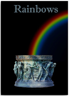
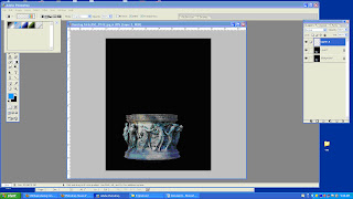
Makin' Rainbows


Sometimes, we gotta make our own luck!

Rainbows can be pretty elusive. But often times they can add just the right colorful something to our photographs…even if we weren't at the right place, at the right time.

Fortunately, making them is not so hard when you know the secrets!


To begin, create a blank layer above your background image.

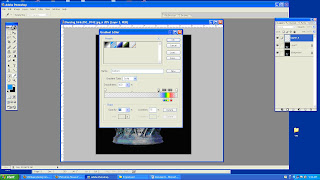
Open the gradient tool (under the paint bucket) and then click on the arrow in the top toolbar to open up the different gradient styles. Use the arrow at top right to open another text dialog box with options.
Choose "Special Effects"


At this point you'll have just a few options. Choose the rainbow looking one at the end. It's called "Russell's Rainbow"


Next, click on the rainbow gradient style in the to
p tool bar. It will open up this adjustment dialog box for the gradient filter. Click and drag the "GRAY" slider slightly toward the rainbow colors until "LOCATION" say 75% Click "OK"


One last thin
g before we apply our rainbow, in the top toolbar, just to the right of the colorful gradient rainbow style, click the second black/white icon to make our gradient draw "RADIAL"

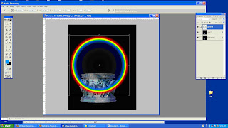
Now we're ready to draw.
Whole holding the SHIFT key to make a perfect circle, click and drag a line up your photo. Just as you'd apply any gradient. When you release the mouse and shift keys, the magic appears. A perfect circular rainbow.


Use EDIT> TRANSFORM to create the size you need and move it into position. Once you have it positioned, we'll go ahead and remove the parts we don't want.

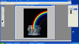
You can use your favorite method for removing the unwanted rainbow parts.
I prefer the LAYER MASK method of erasing, just in case I want to reposition my rainbow later, but you can certainly use the ERASER tool as well.


Two final steps you can use to suit your taste.

Apply a Gaussian blur filter to soften the rainbow a bit.
Change the blend mode on the rainbow layer to SCREEN.

But please, as with everything Photoshop, feel free to experiment with all the blend options available to achieve the right look for all your favorite subjects.


A word of caution though. Remember to account for the lighting conditions in your photo if you're going for realism. The sun should be coming from behind your camera position and be less than 45 degrees in the sky. Ideally, the scene conditions would imply that certain mix of sun and moisture that is usually present when we see rainbows.

To have more tips like these sent right to your email, be sure to sign up for my Tip Card Group.
Better yet, don't wait for tips! Get some for your own self ...right now!
Get a complete deck of "The Original Photoshop Tip Cards" at http://photoshoptipcards.com

Monday, July 27, 2009

Draw Your Best with Photoshop

Many drawing tools, when used to their maximum potential, can help us get through our workload faster and be more creative too.

Today I'll focus on tips for one tool that's used a lot, the marquee tool, and one that many are unsure of, the line and shape drawing tools.

Let's begin.
How to Draw Rounded Rectangles

Grab the rectangle Marquee tool and draw out your rectangle to size.
Go to SELECT -MODIFY - SMOOTH
A dialog box will pop up. Set the radius to determine how much to round the corners.
Start with 20 for most medium sized rectangles.
Larger sizes will obviously need a bigger radius, small sizes less.
=========================================================
How to Draw Perfect Squares

Grab the Rectangle Marquee tool
Hold down the SHIFT key as you draw for a perfect square
=========================================================
How to Draw Perfect Circles

Grab the Elliptical Marquee tool
Hold down the SHIFT key as you draw for a perfect circle

Tip: If you press the SPACEBAR before releasing any commands
(left mouse button or shift key) you can easily reposition your drawn shape by moving the mouse. Once you let go however, it's harder to adjust.
==========================================================
Draw Circle from the Center Out

To draw proportionally from the center out, hold down the Alt key in addition to the other commands. The circle will begin to draw outward from the start position of the cursor, rather than pull from the edge.

==========================================================
Draw a Straight Line

Grab a drawing tool (its the icon located directly under the TEXT (T) icon).
Choose the line tool, then hold down the SHIFT key to draw a straight line in the foreground color indicated.
( draw by left mouse clicking and dragging across the page)

Draw with other shapes as well, by right mouse clicking on the drawing tool icon, then select the shape. Position your cursor (looks like a +) on your workspace and drag to draw.

Once you get comfortable with the drawing tools you'll notice your speed will increase right along with your creative confidence.

Step-by-step instructions make it easy to create!

You wouldn't try to bake a cake or cookies from scratch without a recipe. Would you?

Photoshop Tip Cards are your recipe for success!

The Photoshop Tip Card Deck is your recipe for creating delicious photographs...the kind of photos all your friends and family will drool over! (Now there's a pretty picture!)

It's the simple way to start creating great photos, fast!
Be sure to get yours today at: http://photoshoptipcards.com

Friday, July 24, 2009

Photoshop Filters - Bring Out the Artist in You

One of my favorite things about Photoshop is that it lets me choose between being a photographer and being an artist.

Being a photographer I'm pretty comfortable with. I feel I can handle a camera as well as most, although I'm constantly reminded by those more seasoned, that I still have a lot to learn. And I accept the challenge.

As far as being an artist? Not so good. I used to dabble at painting...and it always looked like a dabble. From that experience I learned that if I wished to express my vision, I'd better put down the brush and go get my camera.

Now, Photoshop let's me be both!

Truth be told...sometimes I don't take a great picture. Shhhh!

But when I draw upon the powers of Photoshop, that same, not-so-great photo can become a really wonderful piece of art to display.

This one here is an example. Overall, the photo was a decent "snapshot". But it really wasn't as crisp and clear as I would have liked and I wasn't happy with the look of the water.

So here's what I did.

I cut the girl from the photo and added a color-tinted (pinkish) gradient overlay across the water and then lightened the top, right corner to give it a more of a sunset feeling.

Next, I returned the young lady to the photo and then applied a filter over the entire photo that I thought appropriate, Ocean Ripple. (Filter - Distort - Ocean Ripple) Now it had that artsy, canvas look. (which worked really well to hide the lack of clarity!)

With minimal blending, using the non-destructive layer-mask dodge and burn method, the photo was complete. Except for the addition of a complimentary frame, created using the technique found in Fool-Proof Frames.

And viola! In just a few minutes time I changed a so-so photo to a wonderful piece of art!

Photoshop lets you save some really marginal pictures and turn them into something to treasure.

Next time you have a photo that you wished was sharper, better colored, or just lacks that certain something, consider saving it with one of the many creative filters available in Photoshop. Have fun and experiment.

Who knows? Photoshop might let you be an artist too!

Wednesday, July 22, 2009

Worldwide Photo Walk 2009

Last Saturday, July 18th, more than 32,600 photographers set off on foot in 900 PhotoWalk events around the world.

This was the second annual event put together by Scott Kelby and the National Association of Photoshop Professionals.

It's designed to bring pro and amateur photographers together to explore and exchange ideas in communities the world over. Groups of 50 local participants, lead by a team leader, head out on a two hour expedition to take photos within their designated territories.

This was my first event, and although I did not feel I had captured any photos which I should submit for the worldwide prize drawing (2 are allowed from each participant) I did meet some interesting folks...and get a lot of exercise!

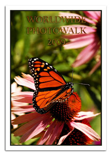
My educational discoveries for this week were how to create realistic looking Gold overlays (as shown on the text in the butterfly photo I took on the walk- above) and a reminder to always be sure to sharpen your photos...if not in the camera then certainly in post-processing.

I used to believe there were only two types of photos that could not be saved by Photoshop.
1.Photos that were "blown out", where extreme light areas left no detail, and
2. Photos that were blurry.

I've revised my thinking of late after discovering a plethora of effective techniques for removing, or should I say "correcting" blur. Of course if you sneeze while taking the photo, that kind of extreme blur will be your burden to carry. Sharpening has limits. But if it's that faint fuzziness that means an eye is not too clear, or your image appears a bit hazy...don't just toss it away.

Save it with one of the many sharpening tools available in Photoshop.

Here are a few I've posted previously or included in the tip card deck:
Sharpen with High Pass Filter
Sharpen with Gaussian Blur
The Unsharp Mask

Photoshop Tip Cards are shipping around the world thanks to my readers.

If you haven't gotten yours yet...what are you waiting for!
They truly are, "A Photoshop Seminar in Every Box!"
(only I saved you the high-priced fee...and took all the notes for you!)

There's still time. Start playing with a full deck today at:
http://photoshoptipcards.com

Friday, July 10, 2009

Cut, Paste, Blend with Ease

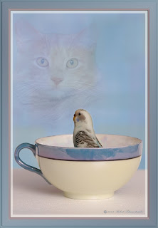
After posting my parakeet/cat photo I was asked, "How'd you blend the cat into the background so well?"

I'll start by saying that I hate the eraser tool for all but the roughest cutouts. Maybe it's a guy thing, but it seems to involve too much commitment! Once you erase it -it's gone. (except for a lengthy history backtracking)

For most "erasing" I prefer to use a Layer Mask.

While on the active layer (the one you want to blend or "erase")
click on the Layer Mask icon (second from the left on your layers pallet, gray square w/circle). This will create an invisible mask over your image based on the background color currently selected. If you show WHITE as your default background, your mask will appear WHITE next to your image on the layers pallet.

The "magic" is, if you now paint with a BLACK brush while on your WHITE mask, your image will be "erased". In other words you won't see your image through the mask. It is still there, but your mask won't let you see it.

It really becomes a non-destructive erasing. And you can vary the opacity of the brush to better control how much you "erase". Or a better term would be "hide". Lowering the opacity toward the outer edges can help you BLEND your image very smoothly.

Here's the best part for me, you're not committed! If you find that you've gone too far, you can paint with the opposite color to get your image "un-masked". So if you painted with BLACK to hide your image, paint over again with WHITE (the same color as your Layer Mask) to return your image to view. You can vary that WHITE opacity too if you just want to bring a little of your image back into view.

Here's a screen shot of how the parakeet/cat photo was created.

[image]

If you look at the cat, Layer 2, you see the cat cutout and to the right of it is the layer mask (WHITE). Then you see a circle of BLACK that was painted on around the outer edges of the cat, in varying opacities. When you look at the big photo preview you can't see those area behind the black. You only see what I want you to see.
And that is the area in the center, the cat's face -which is still WHITE on the mask.

Using soft-edged brushes, of varying opacities on a Layer Mask can really help you Blend images from one photo to another.

In this photo, in order to make the cat appear "dreamy" (or nightmarish as some would argue!) I simply changed the BLEND MODE to Soft Light at 70% after completing the mask.

Start using a Layer Mask to blend instead of the Eraser tool. You'll gain much more control and better looking images too!

Monday, June 29, 2009

Play with a Full Deck


Just a quick note to let you know...

The full deck of Photoshop Tip Cards in now complete!

Now, you too can become an instant Photoshop wiz!

Now, with your own set of Photoshop Tip Cards, you can plow through a pile of pre-printing processes in no time too!

Finally!

There is a simple, low-tech way to get help for the popular Adobe Photoshop editor.

STOP!
Wasting hours with distracting searches on the internet, flipping between screens looking for help as you're trying to work!

DROP!
The time wasting trial and error attempts to remember how to do all the complicated adjustments!

ROLL!
Your creative powers into making eye-catching digital images FAST!

Your house will be on FIRE!
With productivity and imagination.

52 easy to use index cards show in simple terms exactly how to do all the most popular Photoshop edits, tricks and "secret" shortcuts. And thanks to input from our members, printing costs have been substantially reduced. You're going to love (and be amazed at) the price!

Start playing with a full deck!
Get more details or order yours today at:

http://photoshoptipcards.com

Christie said it best...
"I love, love, love your tip cards!"
PhotographybyChristie.net

Yes...they were designed by me for YOU!
Made right here in Buffalo, NY USA!

"Like a Photoshop seminar in every box"
(Only I saved you the high-priced fees and took all the notes for you!)

Thursday, June 18, 2009

7 Profitable Photoshop Plans

Today I'm going to offer something a bit different.

Every once in a while you have to stop and think, "What's the point?"

Having all these great Photoshop tips at hand is a wonderful thing. But many of us are looking for ways to earn more money in photography. Luckily, the two go hand-in-hand.

You can use everything you learn in Photoshop to begin earning more money from your photography.

Here are 7 tips to get you thinking:

1. Add creative borders to your prints.
There is a reason people put thier most important photos into frames with mattes. It's because they look better! And naturally things that look better can sell for more. Fortunately, adding creative frames in Photoshop is not difficult (I've shown that in a previous post) and best of all it costs us nothing but a few moments of our time.

2. Adjust your exposures, sharpness and contrast
This is a bit basic, most of my readers will already be using Photoshop for post-production touch-ups on their photos. But for newbies, I can't think of one professional photographer, no matter how expensive his camera or how great his skill, that isn't using Photoshop or a similar editing software to create just a little bit better photo to sell his/her client.

3. Add Special Effects
How about adding a little vignette (soft border effect) to your photos? Maybe a little background blurr to make your subject stand out? Some shading? Text perhaps? A little color alteration or maybe add a few morew clouds in the sky? Maybe straighten the horizon. Maybe you want everything to be in black and white except some special feature? These can all help you collect more bucks for your pics with no expense but your time.


4. Cut and Paste your subjects into cute scenes
One of the most powerful features of Photoshop is that you can cut subjects from one scene and seemlessly paste them into another. Scott's NewPhotoBiz 1.0 is an amazing program for doing just that. Putting babies onto flowers, hugging fishbowls, and into washtubs can even allow you to make a great full time income from your photography. With all the different scenes and backgrounds available now, you charge for three or more scenes all from one photo! That's 3x the money!

5. Give your subjects "Extreme Makeovers"
With tools like the healing brush, gaussian blur and sharpness controls you can make skin tones flawless. No more pimples, moles, or scars! Tools like Liquify can turn frowns to smiles or make those big noses smaller. Even suck in those big guts making your subjects instantly look 10lbs. thinner. When you make your client look better than they ever imagined, you my friend are a true professional and will be rewarded accordingly.

6. Design your own business cards and flyers
I had struggled for years with other programs to create business cards and flyers. Boy was I surprised when someone flipped the switch in my brain by telling me that I could use Photoshop to to combine words and pictures (duh!). But until Scott from NewPhotoBiz 1.0 told me I never made the connection to creating business materials. With templates available from Vista Print and others, you can design your own custom materials and save a bundle.

7. Create unique custom greeting / holiday cards
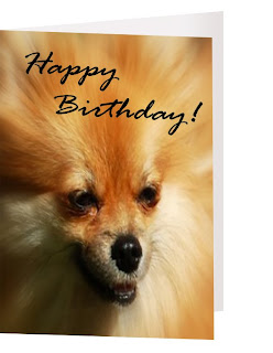
Your profits don't have to end with the photo session. Once your client gets his 5x7's, 8x10's and 16x20's you should be coming back to him often throughout the year with more things to sell him from your original works. Turn those photos into greeting cards like the one shown in todays photo. Thanksgiving and the Christmas holidays should your cue to get a custom card order out to your clients. Offer them postcards, keychains, coasters, tee shirts, golf balls, mugs, water bottles, blankets. None of this stuff has to be pre-ordered by you. There is no expense to you except to make the offer and there are many promotional site that make this easy. Cafepress
is just one site to look at for possibilities. Or start your own store!

Photoshop can be a powerful force that drives more profits into your business. For more ideas on getting the most from Photoshop and photography be sure to check out the other resources at the right on this page, in particular NewPhotoBiz 1.0.

Tuesday, June 9, 2009

Skin Softening with High Pass Filter

Wait a minute!

Didn't we recently do a post
using the
HIGH PASS FILTER
to SHARPEN?


Ah! Do the wonders of
Photoshop ever cease
to amaze?

Yes folks, for my next trick I will now attempt to show you how to soften skin using that high pass filter in another useful way.

Drum roll please...


First off, I had to delay this post for several days because I just couldn't seem to locate a photo that seemed appropriate. Kids and pets are my specialty and neither of them have much use for a skin softening, so I had no stock photos to share and demonstrate. In desperation, I dug deep to find the most appropriate thing I could, "The Princess and the Toad."

Those of you shooting adult portraits and especially teens, will be very happy to have this technique in your toolbox (or better yet in your tip card pack where you can find it!).

So here goes:

1. First up, use Ctrl-J to duplicate your background layer.
2. Change the BLEND mode to OVERLAY
3. FILTER - OTHER -HIGH PASS
You can play with the pixel size here. I found starting at 9.5 is good
4. Use the keyboard shortcut Ctrl-I to invert the layer
Next, dial down the opacity until the skin looks pretty good. Concentrate on the skin texture only, don't worry about fuzzy features like the lips, eyes, hair etc. Will bring 'em back next!
5. Add a LAYER MASK, and paint with BLACK over the detail areas like the eyes, lips, hair, etc. (removing the filter, like an eraser) and watch them return to their original sharpness. You can vary the brush size, type and opacity to fine tune.

So there you have it. The act is complete. All I ask is that you hold your applause and just throw money!

But seriously, if you like what you see here and want more, please sign up for our FREE TIP CARDS if you haven't already, or do click here to request additional packs (of 10 cards ea.) to get the full benefit if you are already a member. We're well on our way to the goal of 52 cards in the full deck now! I'll have a special bonus for anyone holding more than the original10 cards when I get the full deck completed. (You won't want to be caught by surprise holding a short hand!)

Tuesday, June 2, 2009

Photos to Sketch Drawing


After posting the previous lesson on converting color photos to pencil line art, many of you wrote asking for something better suited to portraits.

Your wish is my command!

Here is the simplest method I have ever found:

Duplicate your image using keyboard shortcut Ctrl-J
or you could also use Layer - New - Layer via copy

Next, desaturate (turn to B/W) the new Layer 1 using
Image - Adjustments - Desaturate

Duplicate Layer 1

On the new Layer 2 go to:
Image - Adjustments - Invert
now your photo should look like a negative

Now change the Blend Mode to Color Dodge
Whoops! Your photo just went all white...
well, that's all right.

We're going to now use the magic to give new life
to your photo...it will now be re-born in sketch form.

Ready?

Apply Filter - Blur - Gaussian Blur

BINGO! The magic sketch appears.
Now wasn't that simple and fun?

For best results, move your slider full left then bring back up until you get the best effect. You can also experiment using motion blur or radial blur in place of gaussian.

Finish up, if need be, by getting rid of any stray looking areas. To get the job done use the eraser tool, paint over with a white brush, or use a layer mask technique, whichever you prefer.

Remember, there's nothing like having all these tips right at your fingertips.

Why interrupt your workflow trying to find some technique you saw once before?

Sign up today (at the top right) to join our Photoshop Tip Card group. You'll get a free set of cards to keep by your computer. Then, within seconds you can be putting great tips like these to use...without having to waste hours searching online!

Sometimes, low-tech is better.
Sign up for your FREE Photoshop Tip Cards today!

Saturday, May 30, 2009

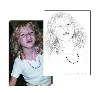
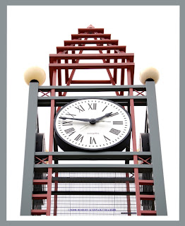
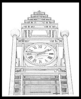
Photos to Pencil Line Art


Here's an interesting and quick way to turn your photographs into pencil drawings.

Mind you, it works best with images that do not have a lot of texture to them. Textured areas tend to become just messy gray zones rather than lines.

To begin, DUPLICATE your image using Ctrl-J

Next, set the foreground color to black then choose,
FILTER - OTHER - HIGH PASS
and select a very small radius. The best radius will depend on each individual image, but generally it will be under 2. The photo above was done at 1.8.

Next, be sure your background color is set to white and go to:
FILTER - SKETCH - NOTE PAPER
and try setting your sliders to:
IMAGE BALANCE : 25
GRAININESS: 0
RELIEF: 0

Then, go to IMAGE - ADJUST - THRESHOLD and move the slider left to make the lines more defined, more black.

As a final step, use either the pencil tool or the brush, with the color set to white, to remove (cover over) any stray black dots that distract from the image.

It's a quick and easy way to turn your images into interesting line art works.

Friday, May 22, 2009

Memorial Day...Polaroid Moments


Happy Memorial Day!

As we remember to honor all the brave men and women who sacrifice much, if not everything, for their country - let us also be reminded to appreciate
all the freedoms we enjoy thanks to their dedicated service.

In order not to take anything away from the importance of honoring these heroes of the United States of America, let me just offer you a simple Photoshop, Polaroid style template into which you can place your favorite photos and possibly a caption which has meaning for you.

http://graphicssoft.about.com/od/freedownloads/ht/polaroidframe.htm

Have a great holiday weekend everyone!
Be sure you use your extra time to Photoshop something!

Clone as Copy & Paste Tool


"Blink!"

That should get about as good a result as "smile!"

Of course I'm being sarcastic. Shouting either of these
words at a portrait session will likely yield those strange,
contorted faces that always sell so well.

But what CAN we do when the proofs come back and
we see that perfect pose, where everything is just right,
except for the closed eyes? What can we do when we get
the blink in an otherwise good shot?

We might try to cut and paste an eye from a similar shot.
We might try to overlay an entire face from a similar shot
and try to twist and erase until we got an acceptable eye overlay.

Or...we might try to use an often overlooked method of copying...
the CLONE tool.

Did you know that you could open a photo, select the CLONE tool,
(doesn't matter what size here) then use ALT-Left Mouse Click
on any portion of your to photo to copy the entire photo?

Sure you can. And it makes for a really easy Copy & Paste method.
We clone (copy) from one photo and then "paint"(paste) it into another.

Here's what you do:

Open your two photos in Photoshop.
We'll use eyes as an example here.

On the photo with the good eyes (or whatever) chose the CLONE tool
then ALT-left mouse click on any portion of that photo.

Next, bring your second photo up to the front (active) position.
As always, DUPLICATE the layer to protect your original.
Then, on add a blank LAYER
Now with the blank layer active, hold down the left mouse button
and begin to "Paint" your cloned layer onto this blank layer.

"Paint" on as much or as little as you need. Don't worry though,
if you paint on too much you can just use the eraser tool to get rid
of anything you don't want.

Because we put the clone on it's own layer, we can manipulate it in many
ways without effecting our photo below. We can use free transform to vary
the size and position. We can vary the opacity if that is appropriate.

We can add a non-destructive Dodge & Burn layer to adjust the layers
for perfect blending.

Using CLONE as a copy and paste tool can be used to create many
different creative effects.

Try it...I think you'll like it!

Tuesday, May 19, 2009

"Pops!" With Gaussian Blur?


Sometimes, amazing results can come from unexpected places.

In fact, going to blur might be considered exactly what we don't want to use when we want to bring out the "POP" factor in our photos. We most often associate the blur with softening, not "popping".

But there's a hidden a secret in this method!

If you cannot already tell, in this tiger photo, the one on the left has been "popped!" while the one on the right is the original. You may click on the image to enlarge for greater detail - as is the case with all the photos seen in this blog.

Here is the simple technique revealed...

1. Open your photo and duplicate Ctrl-J (as always to preserve your original)

2. Go to FILTER - BLUR - GAUSSIAN BLUR and adjust the pixel radius so that you can still clearly see the shapes in your photo but still everything is sufficiently blurred. (in this popped photo the pixel radius was set to 15.8)

3. Here's the secret...change the blend mode on the layers pallet from NORMAL to OVERLAY!

Now is that simple or what! Try it out on your child and pet portraits, landscapes, everything!

Experiment! Instead of changing to OVERLAY, change to VIVID or HARD light. Vary the opacity.

ADVANCED: Want even greater control (as was used in this photo)? Then create a layer mask of the Gaussian blur and use the eraser to selectively apply the blur affect. In the case of the tiger, the darker regions of his face lost definition. Using the blur as a filter mask let me un-blur most of the face to preserve to detail but still create POP!

Gaussian blur to pop! It's in the cards for you.

Monday, May 18, 2009

Universal Contrast Correction


This is one of my favorite, high-speed fixes that has never failed to give me a better looking photograph. Never.

That is why I call it the universal correction. Try it on any photograph you have and see if you agree with me.

It is Part 1 of my 2 favorite quick-fix processes. The other was written about earlier in Better Sharpening w/ High Pass Filter. These two, easy to use processes, are my secret weapon for improving a whole bunch of photos fast, prior to adding any special effects.

So without further ado, here are the steps to Universal Contrast Correction:

1. Open your image and duplicate the background

2. Go to: IMAGE-ADJUSTMENTS-AUTO LEVELS
(this should instantly make your photo look quite a bit better, because it's basically what you would do yourself if you went in to fiddle around with levels and curves adjustments separately)

3. Use keyboard shortcut Ctrl-J to duplicate the newly adjusted layer

4. Go to IMAGE-ADJUSTMENTS- EQUALIZE
Whoops! Now your good photo looks like a bad HDR. But not to worry, we'll fix it back to good again in step 5.

5. Change the BLEND MODE on this layer to Soft Light and drop the OPACITY down to between 30% and 50% based on your own judgment of what looks best for that particular photograph.

6. Finally, go to LAYER-MERGE VISIBLE to complete the process.

Viola! You're done.

Now you've got a secret weapon that will mindlessly improve all your photos in under 60 seconds.

Universal Contrast Correction

Remember, if you need help getting customers for your photography business, if you want simple, proven ideas for marketing your photography services to earn cash...be sure to check out the latest book I co-authored with pro-photographer and marketing genius Dan Eitriem.

Volume 1 was a smash hit. Now, with Volume 2 and 17 more ways to be successful, the only way you can fail is if you're not serious about making photography a real, cash making business.

Click here to have a look-see (but be warned...once seen, you might not be sleeping tonight!)

Sunday, May 17, 2009

Sunday Shortcuts...The Finale


This weekend I was reminded of the seamless beauty of the circle of life. New lives begin, old ones die. With each loss opportunity awaits for life anew.

This is what happens when your favorite location for a photo-hike happens to be in a 260 acre cemetery!

But this is no ordinary cemetery. It is Forest Lawn Cemetery in Buffalo, NY.

Forest Lawn Cemetary. Buffalo History Preserved

Eternal resting place to a U.S. President, a rock star, countless millionaires, artists, world explorers, and pioneers of industry.

But it's not so much the who's but the what's that make this place special.
The what's include: a picturesque lake, rivers and bridges, over 200 species of birds, flowering trees, hills. Art carvings, stained glass, and bronze statuary well suited to honor these residents who have earned their place in history.

At this point you may be wondering,
"Bob, this is all very fascinating, but where are the Sunday Shortcuts?"

Which brings me exactly to my point.

As I pondered life's mysteries while watching and photographing this lovely goose with her new chick, a new life was hatched for Sunday Shortcuts as well.

Rather than dole them out piecemeal fashion, I can offer you printouts of ALL the keyboard shortcuts for your exact version of Photoshop. As an example, I have in my hand ALL the shortcuts for Photoshop 7...and it is a full two pages of 6 pt type!

Best of all...you can get your very own copy of ALL the keyboard shortcuts for your Photoshop version FREE with Pack 2 of the Photoshop Tip Cards.


But only through this special link:
http://tinyurl.com/cardsandbonus

Once I'm notified of your request, I'll send you a personal email to determine what version of Photoshop you are using. Then, I'll pull that Keyboard shortcut printout to send along with your Photoshop Tip Cards Pack 2.

So as we close the book on Sunday Shortcuts, as it fades from life, new life is given to the Shortcuts Printout.

I think you'll find it quite valuable. But since Photoshop House of Cards is about what's helpful for you, click on the comment section below and let me know what YOU would like to have.
And certainly...you can have both!

I'll never know unless you tell me! So be sure to leave a comment below.

But so you don't leave without at least one keyboard shortcut today:

When you turn ON the Caps lock, you enable precise cursor movement. That lets you have a finer control when using the MOVE tool. But here's a companion tip. If you forget to turn OFF Caps lock, your brushes will not be normal. They'll still work, but you won't be able to see the coverage area prior to the action...and you'll be scratching your head as to why.

Here's what you need to do:

1. Sign up today to receive your FREE Photoshop Tip Cards Pack 1 if you are not already a member.

2. Click on the link above to get Photoshop Tip Cards Pack 2 and the bonus Shortcuts Printout.

3. Enter your favorite Photoshop'd photo into the contest that ends this week

4. Leave a comment below

Read the previous posting if you are hesitating to do Steps 1, 2, 3 or 4

Have a great week!

Coming MONDAY: Fast and Furious Contrast Correction- A Universal Fix


Friday, May 15, 2009

If Today Was Your Last Day...


As I cruised down the road today, in my early morning commute, a song came on the radio which colored my thinking for the day. It colors my thoughts now, even as I write this blog entry.

The song is by a group named, "Nickelback"
and is titled, "If today was your last day"

You might find it here at this link on Youtube, but no guarantees because the record label seems to be chasing it down for removal. But you could always "Google" the lyrics.

Click here or copy and paste the link below to hear the song.
http://www.youtube.com/watch?v=StbWZz4pF88&feature=related

As the title implies, it's about taking stock of what you are doing in your life now and what you would be doing if you knew the end was near...like TODAY!

How often do we just wake up into our daily ruts and go mindlessly along the tracks we create in our lives? As if, like the innocent children seen here in today's photo, we imagine life will just automatically be better tomorrow.

But will there be a tomorrow? If so, how many more?

I hope one of the reasons you are here, reading this now, is because you want to become better. Better at producing high quality photos. Better at Photoshop skills. Better at workflow speed. Which will hopefully lead you to better compliments, better customers and better cashflow.

But often times we get caught up in the learning mode (to which I plead exceedingly guilty!) and forget that what we need to do, is DO!

Most importantly, if we are not where we want to be, what SHOULD we be DOING that will bring us closer to our goals?

So today's Photoshop tip is to be sure you DO, not just read through!

Try each tip. Experiment with the sliders, the dials, the deep, deep menu options.

Click on the links at the right of this page if you haven't already. Click on them again and DO something if you just were looking last time. Each posted link is a resource I have personally used to increase my photography skills and increase my income. Each has been tested, proven and receives my highest recommendation as something I feel will be helpful to you too.

When you have done that, get those photos out of your computer and out into the world!

Enter contests, (my contest ends next week so submit your photos!) show your portfolio to prospects, submit your photos to forums for review, or at the very least, get them printed, matted, framed and up on your walls!

Promise yourself you WILL do SOMETHING different today!

Because, God forbid, what IF today was your last day?

Today, I rearranged my schedule and instead spent the day with my Dad, out in the sun helping him rebuild his porch steps. Priceless.