Showing posts with label photos. Show all posts

Wednesday, February 17, 2010

Photoshop Conversion to Black and White


The great thing about Photoshop is there are almost always several ways to accomplish the same result.

The bad thing about Photoshop is we often get confused with all the different ways there are to accomplish the same result.

One technique that often makes good pictures better is turning your digital colored photos into Black & White images.

"Why do that," you ask?

Sometimes, the many different colors or patterns in a photo distract from the overall appearance. Or, sometimes you want to feature only one particular aspect of a scene  - and that can be done with selective color. That's accomplished when you turn the original image to black & white and then allow only your chosen feature(s) to be in color.

Here is a reminder of the most popular ways to turn a colored image to black & white:

Image - Adjustments - Desaturate
Image - Adjustments - Gradient Map (preferred for preserving details) be sure palette set to default B/W
Image - Mode - Grayscale
Image - Adjustments - Threshold (absolute black or white, no grayscale here)
Layer - New Adjustment Layer - Hue/Saturation (move saturation slider max. left) good for selective color by later using layer mask to bring areas back to color

and for the more artistic look...
Filter - Sketch - Chrome
Filter - Sketch - Conte Crayon
Filter - Sketch - Graphic Pen
Filter - Sketch - Halftone Pattern

So next time you've feel the need to go Black and White, plan a few extra moments to try out something new.


Tuesday, June 9, 2009

Skin Softening with High Pass Filter

Wait a minute!

Didn't we recently do a post
using the
HIGH PASS FILTER
to SHARPEN?


Ah! Do the wonders of
Photoshop ever cease
to amaze?

Yes folks, for my next trick I will now attempt to show you how to soften skin using that high pass filter in another useful way.

Drum roll please...


First off, I had to delay this post for several days because I just couldn't seem to locate a photo that seemed appropriate. Kids and pets are my specialty and neither of them have much use for a skin softening, so I had no stock photos to share and demonstrate. In desperation, I dug deep to find the most appropriate thing I could, "The Princess and the Toad."

Those of you shooting adult portraits and especially teens, will be very happy to have this technique in your toolbox (or better yet in your tip card pack where you can find it!).

So here goes:

1. First up, use Ctrl-J to duplicate your background layer.
2. Change the BLEND mode to OVERLAY
3. FILTER - OTHER -HIGH PASS
You can play with the pixel size here. I found starting at 9.5 is good
4. Use the keyboard shortcut Ctrl-I to invert the layer
Next, dial down the opacity until the skin looks pretty good. Concentrate on the skin texture only, don't worry about fuzzy features like the lips, eyes, hair etc. Will bring 'em back next!
5. Add a LAYER MASK, and paint with BLACK over the detail areas like the eyes, lips, hair, etc. (removing the filter, like an eraser) and watch them return to their original sharpness. You can vary the brush size, type and opacity to fine tune.

So there you have it. The act is complete. All I ask is that you hold your applause and just throw money!

But seriously, if you like what you see here and want more, please sign up for our FREE TIP CARDS if you haven't already, or do click here to request additional packs (of 10 cards ea.) to get the full benefit if you are already a member. We're well on our way to the goal of 52 cards in the full deck now! I'll have a special bonus for anyone holding more than the original10 cards when I get the full deck completed. (You won't want to be caught by surprise holding a short hand!)

Saturday, May 30, 2009

Photos to Pencil Line Art


Here's an interesting and quick way to turn your photographs into pencil drawings.

Mind you, it works best with images that do not have a lot of texture to them. Textured areas tend to become just messy gray zones rather than lines.

To begin, DUPLICATE your image using Ctrl-J

Next, set the foreground color to black then choose,
FILTER - OTHER - HIGH PASS
and select a very small radius. The best radius will depend on each individual image, but generally it will be under 2. The photo above was done at 1.8.

Next, be sure your background color is set to white and go to:
FILTER - SKETCH - NOTE PAPER
and try setting your sliders to:
IMAGE BALANCE : 25
GRAININESS: 0
RELIEF: 0

Then, go to IMAGE - ADJUST - THRESHOLD and move the slider left to make the lines more defined, more black.

As a final step, use either the pencil tool or the brush, with the color set to white, to remove (cover over) any stray black dots that distract from the image.

It's a quick and easy way to turn your images into interesting line art works.

Friday, May 22, 2009

Clone as Copy & Paste Tool


"Blink!"

That should get about as good a result as "smile!"

Of course I'm being sarcastic. Shouting either of these
words at a portrait session will likely yield those strange,
contorted faces that always sell so well.

But what CAN we do when the proofs come back and
we see that perfect pose, where everything is just right,
except for the closed eyes? What can we do when we get
the blink in an otherwise good shot?

We might try to cut and paste an eye from a similar shot.
We might try to overlay an entire face from a similar shot
and try to twist and erase until we got an acceptable eye overlay.

Or...we might try to use an often overlooked method of copying...
the CLONE tool.

Did you know that you could open a photo, select the CLONE tool,
(doesn't matter what size here) then use ALT-Left Mouse Click
on any portion of your to photo to copy the entire photo?

Sure you can. And it makes for a really easy Copy & Paste method.
We clone (copy) from one photo and then "paint"(paste) it into another.

Here's what you do:

Open your two photos in Photoshop.
We'll use eyes as an example here.

On the photo with the good eyes (or whatever) chose the CLONE tool
then ALT-left mouse click on any portion of that photo.

Next, bring your second photo up to the front (active) position.
As always, DUPLICATE the layer to protect your original.
Then, on add a blank LAYER
Now with the blank layer active, hold down the left mouse button
and begin to "Paint" your cloned layer onto this blank layer.

"Paint" on as much or as little as you need. Don't worry though,
if you paint on too much you can just use the eraser tool to get rid
of anything you don't want.

Because we put the clone on it's own layer, we can manipulate it in many
ways without effecting our photo below. We can use free transform to vary
the size and position. We can vary the opacity if that is appropriate.

We can add a non-destructive Dodge & Burn layer to adjust the layers
for perfect blending.

Using CLONE as a copy and paste tool can be used to create many
different creative effects.

Try it...I think you'll like it!

Thursday, May 14, 2009

Better Sharpening with High Pass Filter


What's Everybody Looking For?

A better way to sharpen up those images, that's what!

While just about everyone is familiar with using the UNSHARP MASK to sharpen up their photos, there is another less well known and often more effective method.

It is the HIGH PASS FILTER

There are two main reasons why HIGH PASS can be better.

1. UNSHARP mask operates on all of the pixels in your photo. It works by making changes to those pixels...therefore it can be categorized as a destructive process, much like the dodge and burn tool.

2. UNSHARP mask takes the broad approach to sharpening, sharpening everything. Unlike HIGH PASS which limits its process to the edges where the most obvious benefits can be seen from sharpening.

Try this HIGH PASS FILTER method the next time you need a little sharpening done:

Step 1: Open you image and duplicate the background (Ctrl-J)
Step 2: Add a (blank) layer to the top of your stack
Step 3: Ctrl-Alt-Shift-E, this fills your top layer with a flattened version of your background
Step 4: Set Blend Mode on this layer to OVERLAY
Step 5: FILTER- OTHER- HIGH PASS
You'll get a pop-up box with a slider (for Radius) which will have a preview of your image. Slide that slider left until you can only see gray values (no colors) in your preview.
The "sweet spot" will be around the point where you just make the colors go away to see only an outtline of your image and gray. (Usually this radius is way under 10, more likely between 1.5 and 3.5)

That's it! You're done!

To check your results, toggle on/off the high pass layer. You can also bring the opacity slider for this level down to zero and back up to check. Even set the opacity for your own taste.

And there you have it! An alternative, non-destructive option for sharpening up those photos.

Here's a bonus! You can also spot tune your sharpening for more or less effect in certain places by using a 50% gray brush to increase/decrease the effect in particular areas as you desire.

Go ahead and monkey around with it now so you don't forget!

And so you'll have this tip on hand next time you need it, be sure to get signed up for my Photoshop Tips Card Group...its FREE! Plus, new members will receive a very helpful set of Photoshop Tip Cards free when they sign up. These helpful index cards include all the tips you need to crank out great photos every time. Best of all they sit right beside your computer so you don't have to waste time searching online for the tips you need.

Also, be sure to enter the MEMBERS ONLY PHOTO CONTEST going on now.
You'll get full details in your email when you sign up.

Thursday, May 7, 2009

TEXT...Triple Tip Thursday


Get excited today because I've got 3 great tips for you!

The first two will greatly enhance your text work and the last tip will greatly enhance your bank account!

First Text Tip: Changing the font size of text can often be a hassle. Moving the mouse around, clicking, and/or manually typing in font sizes until you get just the right size. Who needs that?

Here's a keyboard shortcut...press 3 keys together, Ctrl-Shift-> to increase the font size at 2pt steps. Press Ctrl-Shift-< to decrease the font size at 2pt steps. If you want to move at larger increments, add the Alt key to move at 10pt increments. So that would be 4 keys together: Ctrl-Shift-Alt-> to get 10pt larger with each hit.

Second Text Tip: If you want to get creative with the shape of your text layer, for example like the perspective view in today's photo, you must first change the text layer into a shape layer. This is done only after you have perfected your text for font size and spelling because once you convert the text layer to a shape layer you can no longer change the individual text characters.

Here's how to change a text layer into a shape layer: With your type layer active, go to LAYER-TYPE-CONVERT TO SHAPE. Once you have done that you can go to EDIT-FREE TRANSFORM and now you will see the changeable box form around your text. Now just drag it around to the shape and size you desire and click ENTER to lock in the change. Remember that to asymetrically change sizes, hold the Ctrl key while dragging in/out your corners to create a perspective view like the one shown today.

Third Tip: As my subscribers and regular readers know I'm a huge fan of Scott's NewPhotoBiz 1.0 One of the great surprises in his material is that photographs of feet sell...big time! Can you imagine taking a picture of children's feet and then selling it for over $200. Scott shows you step by simple step how to do it... over and over again! Parents love showing off this unique style to all their friends! If you haven't already checked out his program, do it now.

Click the colored NewPhotoBiz 1.0 link above or over in the right margin and discover even more secrets to making big bucks with your camera and these Photoshop tips!

Tuesday, May 5, 2009

Faster Cut-Outs

One of the great features of Photoshop is that you can cut out parts of one photo and paste them into another.

(And you can make a lot of money doing it! I'll tell you how at the end of this post)

Or you can just cut your subject out to get rid of the background entirely, as was done in today's photo.

So we agree, cutting is good and useful.

But we might not always agree on the best way because there are so many options. Some harder than others.

1. We could use the eraser tool to slowly and carefully erase all around our subject, hoping we don't accidentally erase something we didn't want to. Not recommended for large areas.

2. We could use the lasso tool to select the edges of our subject by carefully guiding our mouse along the edges. A relatively imperfect task, made a bit easier when the magnetic lasso tool is employed.

3. We could use the magic wand to select our subject. But the magic wand selects based on similar color/tonality. But by holding the SHIFT key and left mouse clicking we could eventually select all the colors/tonalities within of our subject.

4. We could use the magic wand tool on our background. In the case of the photo shown here we would left mouse click in the black area around our subject. Because it is a uniform, solid color it will automatically avoid all of my subject. Then go to SELECT -INVERSE. Now instead of the background being selected, my image is. Now I can lift my lady out of the black by choosing LAYER-NEW LAYER-VIA COPY (or CUT if you prefer)

When your background is more uniform than your subject, selecting the background and then inverting your selection can be a faster, if less obvious, solution many times.

To be efficient, we ideally look for the fastest way. #4 is clearly the easiest and fastest way with this photo here.

It's easy to get confused, have tunnel vision when approaching a task. Doing things the usual way, the way we are comfortable isn't always the best way. A little time spent thinking about all the possibilities before diving in can often be time well spent.

Having your Photoshop Tip cards on your desk to flip through can give many time saving ideas.

Now if you want to make lots of money just cutting babies and pets out of photos and putting them into the cutest scenes, look in the right margin, or click here for Scott's, NewPhotoBiz 1.0

It's a great way to earn extra income, or even full time income using your camera. Best of all, it's recession proof! People love their pets in good economies and bad. And last I heard, they're still making babies all over the place!

Monday, May 4, 2009

5 Photoshop Tips for Cinco de Mayo


Happy Cinco de Mayo!

There are several techniques going on in this Photoshop tip for today. In honor of this special day I have included 5 techniques.

Can you guess how many have already been discussed in previous posts?

If you guessed 2 you would be correct.

#1 The green base was constructed using the same method as in "Fool-proof Frames and Mats" except that here I did not delete the center where the photo would usually go. I left the entire layer intact with the border edge giving it a little 3-D effect. The green base is one layer.

#2 The shadow under the curved photo was from the same technique show previously in "Simple Shadows" where we duplicate our subject to another layer and then blacken it and reduce the opacity to around 50%. In this photo, a little Gaussian Blur was added to the shadow to help feather the edges a touch. The shadow was then flipped vertically (Edit -Transform - Flip Vertically) and moved into a realistic position under the subject.

#3 The third element is adding a white border to the subject picture. To do this just take any photo and...

-Duplicate your layer as always,
-Press the letter "D" shortcut to set your color palette to black foreground/white background
-Go to IMAGE - CANVAS SIZE - (once here change your measuring scale from inches to pixels for both the height and width
-add 50 to 100 pixels equallyto whatever height and width values are shown (your preference on how much border you like to have)
-click OK and you're done. A nice white border around your pic!
(If it turns out your border is black, it's OK! Just grab a bucket of white paint and dump it on the border to change the color...it's easy to forget to change the color palette first)

#4 Bending things. An easy way to bend things is to go to FILTER - DISTORT - SHEAR
The downside is that it will only bend from left to right, not up and down. In that regard you may have been fooled by the Mother Goose photo shown here. Since SHEAR will only bend from left to right, in this case it was necessary to first ROTATE the canvas 90' clockwise before using the FILTER-DISTORT-SHEAR feature, and then rotate it back after completing the bend.
( The shear function is like curves in that it has a line you can bend and mold to all sorts of shapes which will then create the form for your image)

#5 Creative Composition. Remember that the awesome power of Photoshop lies in the layers. Create, compose, stack, blend, mix and match! Bring several techniques together.

One of the easiest ways to create quick compositions is by having Photoshop Tip Cards on your desk beside you. There are so many tips, techniques and cool things you can do...but only if you can remember them! If you have to go surfing the net to find tutorials every time, you're not going to be very productive.

Photoshop Tip Cards solve the problem! Index cards that sit quietly beside you, ready to help when you need inspiration, or just a subtle reminder when you can't seem to remember the crucial steps.

Get a FREE set today! Sign up to join our tip group!

And, if you'd like more detailed instructions on how to create bended, shadowed photos, just drop me an email request (subject line: Bending) to robert@totalfitnessphotography.com

Wednesday, April 29, 2009

LEVELS: Secret to Pin-point Accuracy

In the previous post on CURVES I made mention of my Photoshop workflow process. Many of you wrote asking me to describe my workflow so I thought I would do that today.

Since I described the third step in my process, CURVES, a bit already, today I'll work backward and describe a little tip on my second sequence in processing, LEVELS.

First, to give you the playbook, I always begin optimizing my photographs in Photoshop this 3 step way:

Ctrl-J to duplicate the background so I'm not working on my original. It's automatic to me, a must do, so I'm not even giving it a step number.

1. CROP: Here I compose the photo. Getting the subject where I want it and getting any clutter or distractions out of the picture. More on CROP tomorrow.

2. LEVELS: I use the histogram in LAYER - NEW ADJUSTMENT LAYER - LEVELS.
Today I'll give you a neat trick that lets you optimize your levels adjustment to retain all the pixels.

3. CURVES: After cropping to size and compose, after using LEVELS to set the proper exposure I next move to CURVES to give a little more sharpness and contrast to the photo. On rare occasions I will vary from this, but mostly my curves adjustment will look like this:
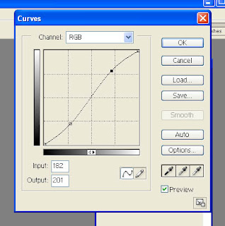


Using these three steps lets me very quickly improve the visual and technical qualities of 80% of my work. The other 20% will need some blemish repair, maybe a little more hue, maybe a little more sharpness, maybe a little Gaussian blur on the background to highlight my subject.

I don't include specialty stuff here, like subject transplants, or creative works like the statue in the previous 2 posts. And of course fun stuff like Scott's NewPhotoBiz 1.0 . But those project all still start out with my 3 step process. Crop, Levels, Curves.

OK, OK! Today's tip on LEVELS.

Often times when you open the levels window, you will see that histogram does not run complete from left to right (aka, dark to light). Maybe it doesn't reach to the dark side, which means you need to move the left slider arrow towards the middle to darken your photo. Maybe the histogram doesn't reach to the right side which means you need to drag the slider arrow toward the middle to lighten your photo.

But if you move it too far, you begin to let pixels drop off. You inadvertantly loose the lightest or darkest values. Sometimes, that's ok. But what if you want to keep everything?

Here's the tip!

Hold the (Alt) key down while you move the sliders.
Watch your photo now as you move the sliders.

If you are moving the right (lightest) slider arrow your photo will start out as black. As you move it left, towards the middle of the histogram to lighten your photo, you will begin to see a light appear from your subject. As soon as you see the first light, stop. That is the lightest pixel.

If you are moving the left (darkest) slider arrow your photo will start out white. As you move the arrow right, towards the middle of the histogram to darken your photo, you will begin to see colors appear. Stop. At that point you are revealing the darkest values in your photo.

There you have it. Now you know exactly where the lightest and darkest values lie on your photo. That's not to say it's bad to go past that point. It's OK to knock a few pixels off if it makes for a better photo in the end. But at least you won't inadvertently be losing them because you GUESSED where you should put the slider. now you can KNOW!

Be sure to sign up for my Tip Cards at the upper right of your screen. In addition to getting a FREE set of Photoshop Tip Cards for handy desktop reference, next week I'll be letting my Photoshop Tip Card Members in on a new book I co-authored with another very well known photographer and marketing expert.

In the book you'll discover great new ways to boost your photography income
(or even get yourself started in this great business with very little expense!)

Go ahead now...SIGN UP...it's free!

And tune in tomorrow for more CROP!

This is Robert Schwarztrauber, signing off to go Photoshop something.

Tuesday, April 28, 2009

Sexy Curves Turn Granite to Gold

Normally you would never see a photo this bad on my site. After all, isn't that what separates the amateurs from the pros...the pros only show the good photos?

But I thought it was educational in many ways. Lots of tips I could glean from one photo disaster.

If, upon seeing today's photo you thought, "That looks familiar?" You would be correct... it's the same photo I showed on the last post as teaser for today. (Look back to "Simple Starburst Effect" as we go along to compare)

So here's the tips that come to mind:


1. We don't always get to choose our backdrop. Sometimes we must shoot a beautiful subject surrounded by junk. So we must learn to deal with it! (aka cut out the subject with Photoshop and drop it into another background, whether that be plain white, textured colors, fresh scenes, or as in this case, plain black.

2. Sometimes our lives need more pizazz!
A little excitement! A little glitz!
In many cases where our subject contains only a little color (as in this granite statue) it looks better to switch to black and white letting the shadows and lights add dimension. But sometimes it would be great to really jazz it up.

Wouldn't it be great if you could have the "Midas Touch" where everything you Photoshop'd turned to gold?

O.K.. Here it comes! The part where I show you how sexy CURVES can be while at the same time giving you the "Midas Touch."

A digression. Isn't it ironic how Photoshop allows us the ultimate freedom to be creative, and yet we want someone to show us how? Hmmm? ( I still search the internet daily to find new techniques, new discoveries...someone to show me how to use the tools to be more "creative")

Well because I love to push the boundaries and because I "hate rules", I had an opportunity to discover something cool in Photoshop curves that I wanted to share with you today.

Normally, as part two of my standard workflow, just after the levels adjustment, I go to
LAYER - NEW ADJUSTMENT LAYER - CURVES.
Here I find the diagonal line that flows from dark at the lower left corner to light at the upper right corner. I do a couple of minute tweaks to the line (usually creating a very slight S curve) which improves the contrast in my photos. That's it.

But on one particular occassion I knew I had a great subject (this statue) but I couldn't get it to "POP". It was just too average. So I started tugging on the curve's line.

You can create many points to pull that line up and down. You can control where dark begins and light ends. You can even (take a deep breath or look away as I break the "rules" now)
TOUCH THE BOTTOM! TOUCH THE TOP! ...the walls of the box which are normally out of bounds (because they max-out the software and allow uncontroled events to occur... like wicked color changes!).

And therein lies the secret. You can create metallic-like colors and bold expressions when you step off the path and really get creative with CURVES. Because each photo contains pixels of every shade and hue, I cannot tell you exactly what setting will do what. But what I can tell you for certain is that you can really add some spice to your works when you start banging that line around in CURVES. Experiment, Try it today!

3. An important note on experimentation. Tip number three is to ALWAYS start your Photoshop workflow by DUPLICATING your original layer. Just start by pressing the shortcut Ctrl-J. Once that is done you never have to worry about experimenting. You can play to your hearts desire without ever effecting your original. You can always go home. And your original is safe.

(sorry for those of you who thought today might be about shooting sexy photos of expecting moms, although she was the subject in the photo, today was just about Photoshop curves.)

That being said...CURVES are sexy!
So go break some (Curves) rules today!

Monday, April 27, 2009

Simple Starburst Effect

As I promised yesterday, today I will explain how to create a simple starburst effect on your photos, like the subtle one shown on yesterdays Sunrise photo.

This technique works best if there are many points of light (highlights, pinpoints of bright white in contrast with a darker surrounding). It is those points that will ultimately create the effect.

The simplest way to do it, is by using the FILTER mode.

But first we must prepare out workspace by duplicating our original two times.

Step 1 : DUPLICATE your background twice (I like to use keyboard shortcut, Ctrl-J

Before we begin to create the effect we must now have 3 identical layers showing on layers palette.

With the top layer selected,

Step 2 : Filter - Blur - Motion Blur
on the pop-up box we need to set the angle to (45)
and max-out the distance to 999

Turn off that top later and select the Middle Layer next.

Step 3 : Filter - Blur - Motion Blur
on the pop-up box we need to set the angle to (-45)
and max-out the distance to 999

Step 4 : Go back up to the top layer and turn it on, then change the Blend Mode to Screen

Step 5 : Go up to the menu and choose LAYER - MERGE DOWN (shortcut Ctrl-E)

Now you should see the starburst effect (criss cross)

Step 6 : On the newly merged layer (top one because at this point you should just have two layers showing on your layers palette) change that Blend Mode to Screen

You should now be seeing a pretty good image formed showing the starburst effect, but it is probably too light because we have been changing blend modes to screen (remember screen mode is a lightener)

To get the exposure looking right,

Step 7 : go to IMAGE - ADJUSTMENTS - LEVELS and lets move that left hand slider over towards the right a bit to darken up our photo.

Wow! That's it. Seven simple steps to starburst stardom!

With that 7 step system now in your toolbelt you'll be creating cool photos like the sunrise shown on Sunday's Shortcuts in no time! Or something even better I suspect!

One note though. If you find that the starburst are over-powering your subject, take the ERASER (set at 10-20%) on your top layer and lightly erase the effect from over your subject
(or you could use a layer mask as well if the eraser tool scares you.)

I was reminded of this from a post on Scott's NewPhotoBiz forum, (one of the members posted the www.gavtrain.com link) If you haven't checked out NewPhotoBiz 1.0 yet, check over in the right margin where you'll find a link to Scott's site. Really, every photographer who wants to create great images and make money doing it the easy way should be a member of Scott's group
( I know I jumped at the chance when I found out!)

And remember to sign up for your free tip cards here too, top right.

Tune in tomorrow to see why CURVES are so sexy and what that has to do with the "Midas Touch"

Friday, April 24, 2009

2 Popular Blend Modes

Here's a little behind the scenes look at 2 popular blend modes and how they work.

But before I begin, I received so many nice comments on the previous stained glass photo in "Dead Colors Come Alive" I thought I would post another of my favorites here today. Again, this rare bit of secular stained glass was found in Forest Lawn Cemetery. It is on the list of national historic places - President McKinley was buried here. Aside from being the eternal resting place of many famous Americans of the 1800's, it also houses some of the most beautiful outdoor artworks in the city. I hope you'll enjoy today's selected photo! A sunrise full of hope.

And as an additional note for those who might be straining to look for some connection between the tips being offered in this blog and the photos beside each piece, there is none. Except to say that all of the photos have been put through a Photoshop enhancement of one kind or another...and probably many.

That said, let's talk about two popular blend modes, how they work, and what they can do to make your photos more appealing.

First up is MULTIPLY.

You will find that Photoshop's default blend mode is NORMAL. If you change the blend mode to MULTIPLY, Photoshop will take out the light (white) pixels and multiply the dark ones. If you have a photo that is dominated by too much lightness, maybe outdoors on a sunny day, or a bit too heavy on the flash, a quick way to darken it up is to change the blend mode to MULTIPLY. Be sure to use the opacity slider to fine tune it because in most cases just switching blend modes here will make your photo too dark. Decrease the opacity for a better effect.

Next up is SCREEN.

The SCREEN mode is basically the opposite if MULTIPLY. In screen mode Photoshop takes out the dark pixels. When you change from NORMAL to SCREEN you will see your photo appear washed out, too light. Again, adjust the opacity to gain a more favorable effect. If you find your prints always come out too dark, despite looking great on your monitor, SCREEN is a great way to lighten your photos after you have made all other adjustments in Photoshop and are ready to print. (click for more details on using screen to correct dark prints)

These two blend modes can be great time savers when you know how they work. And now you do! So whenever you want nice control over your lights and darks get out your own Photoshop and experiment with blend modes...and their opacity slider.

Be sure to check back on Sunday. This week I'll begin "SHORTCUT SUNDAYS".

Each Sunday will now be dedicated to showing you the hidden keyboard shortcuts in Photoshop. Great tips to shorten your time on the computer so you can spend more time behind the camera.

Tuesday, April 21, 2009

Notes on History


At some point in our lives, we all wish we could go back in time and do things just a bit differently.

We'd like a do-over.

Well, as photographers we know we can stop time with our cameras, right? So, is it really a stretch to think we can use our great software, Photoshop, to actually go back in time?

In reality, the creators of Photoshop, in their infinite wisdom (how they actually created such a thing in the first place boggles my mind!) realized that occasionally, we might make a mistake, an errant keystroke perhaps. When this occurred we might be frustrated if we couldn't go back and "undo".

And so they gave us the power to go back in time. The almighty "UNDO". In fact, they not only gave us one UNDO, but through use of a built-in memory system called HISTORY, they let us have several whacks at UNDOing"

Alas, though they were generous to a (de) fault, sometimes we find that we just can't go back far enough, right?

But perhaps you have been imprisoned by your own thoughts?

You CAN change "HISTORY"!

You can change it from it's default of "20" to a much more reasonable number for us mortals, like between 50 and 100. (However, don't get carried away with your new-found power. If you get crazy and decide to set the history to 999, you'll pay the ultimate price. Photoshop will eat your every last gigabyte of memory trying to keep track of what you are doing. Ultimately, your system will slow to a snails pace. Just remember, the higher default you set, the more memory is consumed.)

So here's the simple HISTORY tip that will save you many hours of frustration and deleted layers:

Go to EDIT - PREFERENCES -PERFORMANCE
("PERFORMANCE" might be "GENERAL" on versions 7 and earlier)
Look for HISTORY STATES. Change the number from 20 to anywhere, say 50 -100, and click, "OK".

You're done!

It's a really simple tip but one that's often overlooked.
Doing this can really make your time with Photoshop a much more pleasureable experience.