Wednesday, December 15, 2010

Text... Your Way!


Text...options beyond the Photoshop menu.

Many times you'd like to have your text in bold, or italics, but the options aren't offered in the Photoshop selection dropdowns. If you accept these limitations, you'll be forced to compromise.

But it doesn't have to be this way! You can have it YOUR WAY!

In the case of italics, you simply type your text, then right click on the text layer in your layers palette and select RASTERIZE LAYER. That will change your "text" into a "shape". (Be sure your spelling is correct because after you rasterize you can no longer change the individual letters or font without starting over).

Once your layer has been RASTERIZED (turned into a Photoshop shape) you can then use EDIT>FREE TRANSFORM to slant your text into italics. Hold down the Ctrl key as you drag your top corners to the right and you can achieve any degree of italic slant.

BOLD text can be achieved by simply making a copy of your text layer and changing the BLEND MODE on your new (top) text layer to MULTIPLY. And/Or, you can use the same method we used for italics, RASTERIZE to create a shape layer and then use TRANSFORM to make it just a bit larger too.

Photoshop gives us a lot of great gifts to work with, but it's nice to know we can still exchange them for what we really want. Options...who among us would not like more?

Robert Schwarztrauber

Reminder...Only a few days left to get your "Photoshop Recipe Card" book in the FREE Holiday Gift Box. Order by this Sunday (Dec. 19) to insure delivery by Christmas.

Saturday, December 11, 2010

3 Quick and Useful Photoshop Tips

Everybody's busy at the holidays (including me!)
so here's just 3 quick tips that will speed you
on your Photoshop way  - so you can get back out
there and finish your shopping!

1…Make a New Document from a Layer
To create a brand new picture from any layer,   
go into the Layers palette and choose Duplicate Layer. 
Then, change the document setting to "New”, say OK,
and begin working fresh on a new picture file from there.


2…Layers Palette or Tool Bar Getting in the way?
Press “Tab” to make them magically disappear.
Press "Tab" again and they’ll come back.

3…How’s the view?
Expand your viewing and work options by pressing the letter ‘F’
to toggle through your view options up to full screen.

That's it!

Go on now. There's is no more. Oh, wait. There is one more thing...

Until next time...remember to really take time to enjoy the holiday season because, as the late Andy Rooney  used to say, "Life is like a roll of toilet paper. The closer it gets to the end, the faster it goes."

We all could use just a little more time.

Robert Schwarztrauber


Thursday, December 2, 2010

Photoshop Creative Art with Filters


Sometimes, the best way to learn is to play!

The video above offers a fun way to use Photoshop Filters to create your own stunning art collection.

Photoshop is more than just a photo fixer. It's a powerful creator too!

Best of all, you'll be learning all sorts of useful Photoshop tips, tricks and techniques using layers, masks and blend modes while you're having fun!

No worries here mate! You can't ruin your photo because it's 100% Photoshop generated. And Photoshop does all the work with your artistic guidance!

Have a peek at the video. Then, for more inspiration, you can view additional samples on my web gallery at: http://robertschwarztrauber.weebly.com/photoshop-creative-art.html

Have fun while you learn and play with Photoshop Filters!

Robert Schwarztrauber

Then...be sure to order your Photoshop Recipe Card book today!
Now, shipped in their very own gift box thru December 25th.
Makes a great gift for less than 20 bucks!
http://photoshoptipcards.com

Thursday, November 25, 2010

Happy Thanksgiving!


Happy Thanksgiving
one and all!

Luckily, I was able to convince this fowl creature to give me his camera, before he smartly turned and swam off to safety. Far better to have the photo, than to talk about the one that got away.


While I'm certainly thankful for the coming of digital photography, and for the creative expression Photoshop provides, I am most thankful for the community of fellow artists and enthusiasts who allow me to share my passion with them. Thank you for your readership and contributions.

And I am thankful for all the many talented artists who share their work across the internet to inspire, to teach, and often just to amuse us with the products of their photographic and editorial skills.

So, to thank you for stopping by on this day of celebration, I will share with you not a tip, but a bit of artistic inspiration and amusement. I hope you'll enjoy the work these talented artists have created with the technology at hand, but mostly with the greatest gift that they got for free...their creative minds.

Here is a link to their work. Enjoy!

http://www.thephotoargus.com/inspiration/42-magnificent-photo-manipulation-examples-that-will-inspire-you/

Monday, November 15, 2010

Actions...Consistant, Time-Saving Results

Everyone laughed at Bill Gates. Crazy they thought. A computer in everyone's home? What for? All they do is multiply and subtract numbers at lightening speed.

But nobody's laughing at Bill now! Bill realized how much more potential computers really had. Now, in addition to being our favorite creative tool, they are also the worlds favorite communications device.

But still, at it's core, the computer is great for performing acts of repetition. And sometimes we need that in Photoshop.

Whether we want to process a folder of 100's of photos or just repeat a special effects process that someone else created, we can do that with Photoshop Actions. At the push of a button!

Enjoy this introduction to Photoshop Actions in the video below.

Lightening Fast Word Graphics

In the previous post, I promised to tell you how to create word graphics for Photoshop with lightening speed. It's a great tip I picked up from legendary Photoshop guru Matt Kloskowski, of NAPP fame.


Hope you enjoyed that shortcut. But the fun doesn't have to end there! Get really creative by playing with the blend modes. Add shadows, bevels, and highlights. Create a clipping path, add a filter, distort with free transform.

As the holiday season approaches, I'm reminded that it is so much fun to give. That's why I give these tips!

And...that's why giving your favorite photographer a gift-boxed copy of the nationally popular "Photoshop Recipe Cards" is one of the most affordable photography gifts you can give this year.

Check out the new holiday gift offer over at:
http://photoshoptipcards.com

Tuesday, November 9, 2010

10 Most Common Workflow Elements


Whenever I'm asked to teach someone Photoshop, I always start with the work flow techniques I find most useful. After all, learning how to seamlessly apply the LIQUIFY tool will hardly be a good use of time if the most basic elements of your photo are out of whack.

So, here in this post I'll tell you my Top 10 Most Used, most essential techniques for creating great images. These are 10 common elements that I use 100% of the time when I edit an image in Photoshop - and why. In just a general order of importance:

1. LEVELS - under LAYERS - NEW ADJUSTMENT LAYER - LEVELS 
To set the overall photo exposure (lightness or darkness). Use the histogram image to drag the light (rt slider mark) or dark (left slider mark) in to just  touch the edge of your histogram image. If you go beyond the touch you will be clipping pixel from your image. Sometimes that's OK, just a word of caution.

2. CURVES - under LAYERS - NEW ADJUSTMENT LAYER - CURVES
This allows me to add just a bit of contrast to create a more intense image. I've covered this elsewhere on the blog so I just restate that it basically puts just a slight "S" curve to the diagonal line. Also, I'll use CURVES to adjust the white balance if needed. Just click the white eyedropper and then sample somewhere on your photo that is supposed to be white. Zoom in if needed. The white of someones eyes are often good reference points (but not if it's you're buddy who was out drinking all night!)

3. CLONE STAMP - in the tool palette by your eraser and paintbrush. Hardly ever get an image without some spot, pimple, reflection, shadow, ghost, or intrusion that doesn't need to be covered up.

4. Ctrl-J  The ultimate layer duplication shortcut. What more can I say?

5. FILTER - OTHER - HIGH PASS, my preferred sharpening method. Use Ctrl-J to duplicate the layer you wish to sharpen. Once in, slide the marker to the left until most of the color is gone (usually pretty low on the scale, <10.) Click OK. Change the blend mode on this layer to OVERLAY. Adjust the blend mode opacity to less that 100% if it looks too sharp. Use Ctrl-E to merge this new layer down over your original and you're done.

6. MASK - the layer mask (icon that looks like a rectangle with a white circle in it) when added to a layer let's you selectively paint in or out the parts of that layer that you do not want seen. Painting with the BLACK brush will hide (or MASK) anything on that layer. 100% opacity will mask completely. Use less that 100% to fade the hiding or blend to the surroundings. But it's reversible! If you want to change what you did with black, paint it back using white!

7. RECTANGULAR MARQUEE - it's the crop before the crop. Use the rectangular marquee to copy portions of your image to a new layer for further editing. Until you figure out just how much of the photo to keep, the rectangular marquee gives you time to play with your image a bit and still undo your changes. Once you use crop, all the surrounding area of your photo, down through all the layers is gone.

8. Ctrl - New Layer Icon - this puts a new layer BELOW the one currently active. Photoshop will put your new layer always directly above the one currently active unless you give it a modifying command like Ctrl. I use this mostly for background coloring, isolating layers,  previews, or creating frames or borders.

9. Ctrl - Alt - Shift - E - this command will merge all the visible layers together into one, like FLATTEN, but with one critical distinction...all the previous layers remain in their original state. Flatten is a true merge, all of your layers will be combined into one layer which means you will lose the ability o go back and make changes if you don't like the way they blended. However, Ctrl-Alt-Shift-E will create the composite just like FLATTEN, but will do so without actually removing all the layers. It's like a great reversible PREVIEW of flatten, before the actual flatten. To use: Create a new blank layer at the top of the layers stack, then press together Ctrl-Alt-Shift-E.

10. CROP - almost everybody needs more Crop. The great photographer Robert Capa once said,  "If your photographs aren't good enough, you're not close enough."  Well, if at the Photoshop editing stage, there isn't anything we can do to physically get closer to our subject, but we can simulate the effect of closeness by zooming in. Compose your photo using the Rule of Thirds and the CROP tool to get rid of any elements that distract from the story your photo was supposed to tell.

That was a long post, but hopefully helpful.

At the risk of running on, I would be remiss if I didn't tell you that from now (11/9/2010) until December 24th the beloved PHOTOSHOP RECIPE CARD books will be shipped in their very own FREE GIFT BOX!

So whether you order for yourself, or for that special shutterbug on your Christmas List, these cards will make a wonderful holiday gift. Just click on the link here > PHOTOSHOP RECIPE CARDS< or the RECIPE CARD ad at the top right.

In my next post, I'll show you how I created that crazy word graphic above in less than 30 seconds!

Robert Schwarztrauber


Saturday, October 23, 2010

Yesterday I promised if you stayed tuned I'd have a great Photoshop deal for you.

Shane Goldberg, an expert Photoshop teacher,
sent me an email the other day I knew I'd
have to share with everyone.

Rather than drone on, he's given me permission
to share that email with my readers here...
================================
Hi Bob,

I need your help.

I've got 600 Photoshop Elements Training DVD's in my garage.
I HAVE to get rid of them (for a number of reasons) NOW!!!

They were selling for $89.95 but they're getting older now
and there's new versions of Elements out now etc.

Anyway, here's the link it's directly to Paypal.
https://www.paypal.com/cgi-bin/webscr?cmd=_s-xclick&hosted_button_id=MWEBZDCDCEQF6

I want you to have one even if you don't own Elements as
there are 85+ video tutorials on there, practice images
and the DVD is a GREAT Christmas present! (it's shrink wrapped
and professionally produced)

So for $10 that will cover my shipping and you get yourself
a killer DVD for yourself or someone special ;)
https://www.paypal.com/cgi-bin/webscr?cmd=_s-xclick&hosted_button_id=MWEBZDCDCEQF6

Have a great day, Hope you can help me out!

Thanks heaps,
Shane
PhotoshopZoo.com

p.s. You can order as many as you want, i've got stacks of them!

p.p.s if you have any questions let me know shane@photoshopzoo.com

=======================================================
He says...


This DVD includes...

85+ Awesome Video tutorials on everything from:

    * Organizing & Tagging your photos
    * The Tool palette (all about the tools!)
    * Tips, Tricks & more cool stuff
    * Color - Hue & Saturation (color adjustments)! Very cool
    * Layers, Layer Masks etc.
    * Digital Photo Editing
    * Cool Effects in Elements
    * and Productivity Techniques....

That's it over 6 hours of awesome video tutorials

=============================================

Looks like a great deal to me!
I got mine without hesitation.

For $10...how could you go wrong?
You'd have to learn something right?

Just to be upfront, there's nothing in this deal for me.
I have no ties to Shane, monetarily or otherwise, beyond
my respect for his work. I just thought it was a deal
that was too good for any Photoshop student (and aren't
we all really?) to pass up.

But, he's movin' them out before his wife does
it for him. So this offer won't last long.

Stretch your ten dollars and get this DVD.
Here's the link once more:
https://www.paypal.com/cgi-bin/webscr?cmd=_s-xclick&hosted_button_id=MWEBZDCDCEQF6

by Robert Schwarztrauber

Thursday, October 21, 2010

Stretching for Elements Users


Stay tuned...

I'm planning something big for my oft neglected Elements users.
If all goes well you'll be very happy with me by the end of this week.

If all doesn't go well, at least you'll know I tried.
I'm thinking about you.

============================================
While you're waiting, I hope (if you haven't already)
you'll take a couple minutes to help me with
my research project on the effects of Photography
on those who do it.

It's a simple 10 question, multiple choice survey.
It's completely anonymous.
No names. No emails. No offers.
Pure and simple research. 10 questions.
And unlike school, no one fails.

Why not take a minute (while you're waiting)
to give me your take on Photography?

Here's the link:
http://www.surveymonkey.com/s/BMG3WNP
===========================================


Thanks and Stay tuned!

Friday, October 15, 2010

Control Your Photoshop

I still remember the joy I felt
when I realized that I finally "got it".

After months of frustration,
opening then just as suddenly
closing Photoshop, in a huff
because I couldn't figure out
how to make it work,
the day finally came when
I could edit a photo.
Poorly at first. But my
learning curve rose sharply
from there.

Control had shifted. Now I was in control!

And so today I bring you some of my favorite
CONTROL keyboard shortcuts
to help you tame the Photoshop beast.

And, I'll show you where to get a PDF list of
all the Photoshop keyboard shortcut commands
for your system.

And, If you haven't yet contributed to my
research study on what photography means
to you, I'll give you that link again. It will help
me tailor my messages and tips to your desires.

So first, here are my favorite "Control Freak"
keyboard shortcuts...

Ctrl-J  Duplicate the current layer
Ctrl-E Merge your current layer to the one
            directly below (merge down)
Ctrl-H Stop those "ants" from marching
            Repeat to make them start again
Ctrl-Z Undo your last command
Ctrl +  Zoom in
Ctr l-   Zoom out
Ctrl- Left mouse click on Layer Thumbnail
         (creates a selection of the entire layer
          with marching ants and everything!)
Ctrl-  Click on create New Layer icon to
         put your new layer BELOW the current one
Ctrl-Alt-Shift-E  Create a new layer then use this to
                          Merge all active layers together
                          (it's like flatten all layers but the individual
                           layers are preserved so you can still
                           go back and make changes if you wish.)

Well, that should help you take control and gain some speed
in your editing.

======================================

I hope you can help me in my research, The results
have been very interesting so far. It's just 10 simple
multiple choice questions in an anonymous online survey
hosted by SurveyMonkey. I'll be sharing my findings
here in a later post so make your thoughts known!
Here's the link, it will just take you a minute
and help me a lot...

http://www.surveymonkey.com/s/BMG3WNP
====================================

Finally, If you want a complete PDF of all the
keyboard shortcuts for:

    * Adobe Photoshop CS4
    * Adobe Photoshop CS3
    * Adobe Photoshop CS2
    * Adobe Photoshop CS
    * Adobe Photoshop 7
    * Adobe Photoshop 6
    * Adobe Photoshop 5
    * Adobe Bridge & Adobe Camera Raw

Go Here:
http://morris-photographics.com/photoshop/shortcuts/index.html

That's it for today!
I hope you took time to complete the survey above.

Sunday, September 19, 2010

Look 10 Years Younger...in Less than 30 Seconds!


Babies know the secret to looking young...it's softer skin!

In today's quick tip I'll give you the fastest way to turn back the hands of time on those of us who no longer wearing our original birthday suits. The fastest Photoshop way, that is.

Here's a tip ripped straight from the pages of "The Original Photoshop Recipe Book"  Page 41 to be exact.

Skin Soften with High Pass Filter

Step 1: Duplicate your background layer
Step 2: Change the new layer's BLEND mode to OVERLAY
Step 3: Go to FILTER > OTHER > HIGH PASS
Step 4: Set the pixel value to 9.5 and click OK
Step 5: Press CTRL-I to invert the layer (photo will get blurry)
Step 6: Begin reducing the layer OPACITY until a nice skin smoothness
is obtained.
Step 7: Add a layer mask and paint with a soft brush (color:black)
over features that should be sharper (like eyes, inner lips, teeth, hair, etc)

In less than 30 seconds you can remove years from the faces of those you love. (or those you are trying to sell portraits to!)

BONUS: This will also help to diminish the appearance of stray hairs across the face, acne blemishes, scars and blotchy skin! A 30 second cosmetic surgery!

Be sure to sign up for my Photoshop Tip Group using the form in the right-hand column. That way you'll never miss out on the ONE tip that might have saved your project!

Also, be sure to join us on my new Facebook Group. It's called "Photoshop Friends". Just type that into your Facebook search (without the quote marks) to find us. Share your favorite photos with us!

Also, if you like this post and want to see more like it, be sure to click the [f] in the toolbar below to "Like" this on FACEBOOK. Thanks!

Monday, August 16, 2010

FONT SHAPES SAVE TIME

I'd often wondered what the use was for those shape fonts.

Arial, Times Roman, even Helvetica and Courier I understood. I could read those letters.

But Webdings and Wingdings? To me they were just shapes and nonsense.

Until I learned the secret!

They are shortcuts to drawing shapes by hand.

Need a square box? Webdings "C"
Need a cube? Wingdings "Q"

Works especially well if you need multiple repeating shapes in a straight line...ooh! So easy!

Think of the patterns or backgrounds you could create.

Here in this photo I used the Yin-Yang symbol to disguise the out-of-this-world critter. Can you guess what is is?
(Hint: It's actually facing up, not down!) Leave a comment so folks see how smart you are!

So next time you're looking to add some creative design elements, think crazy fonts for a BIG time savings.

Added benefit is you have two ways to change the size. Use the FONT size in the toolbar. Or for more versatility as an actual SHAPE design, right click on your TEXT layer and choose RASTERIZE. That will turn your text into an actual shape where you can use EDIT>TRANSFORM or FREE TRANSFORM. However, remember that once you rasterize you cannot go back to edit the character as TEXT.

For future reference, I'd suggest creating a sample page where you select each font and go across the keyboard from top to bottom, left to right. Then, when you need a shape you just look at your template and select.

Here's one page I created as example:

Have fun with it. It's a great shortcut when you don't want to draw free-hand or use PATHS to draw your common shapes.

Everyone is welcomed to share these tips freely as long as they are copied in whole included and credited to me, Robert Schwarztrauber and ideally with the link back to http://photoshophouseofcards.blogspot.com

Or use the convenient sharing links below.

Wednesday, July 21, 2010

The Greatest Photoshop Tool


The greatest Photoshop tool can't be found on any toolbar or menu.

It's seldom talked about in any manual, tutorial, or DVD.

However, when used well, it can completely transform and elevate your photos. And draw favorable attention and applause from those who view your work. Happily, this tool doesn't even require that you have any great Photoshop skills to use it.

That one extraordinary tool is your imagination.

Consider the sample photo above which contains only three simple elements:

1. A colorful photo of a woman (marching in a parade)
2. A photo of my arm holding a paint brush
3. A color-filled rectangle (with a portion erased)

Essentially it's two cutouts and a drawn colored box. Two techniques easy to master with any assortment or combination of tools in Photoshop.

And once I have the cutouts I can re-use them in any number of different scenes. Even create a series of prints.

Sure you say, imagination is great. But I'm just not very creative.
I can never think of what to make.

Fortunately, there is a way to boost your powers of imagination.
It's EASY and it's FUN!

One of the simplest ways is improve your imagination, your thinking, your ideas about what's possible is to surf the net. There are hundreds, thousands of websites you can go to to see what others are doing. To get ideas.

My favorite happens to be Flickr.com because of it's variety. Surf around, join some groups once you hone in on a style that interests you.That's how I got hooked on OOB's (out-of-bounds). Essentially photos within photos that take on a 3-D look.

Next time you're feeling creative, but lacking in ideas to get started, look around. Fire up your imagination by surfing around a while. Or go the museum and get a feel for the composition and colors used by the masters.

Not to create a poor copy of someone else's work, but to stimulate the almighty power of your brain.

Then dice up some old photos that aren't good as a whole and use those pieces to create yor own Photoshop masterpiece.

The mind. It's a terrible thing to waste.

And one of your greatest Photoshop tools.

NOTE: While you have to build your own imagination, I can help you build all your other Photoshop skills with the new, PHOTOSHOP RECIPE CARDS. It's one of the best, and most inexpensive resources available for putting the full power of Photoshop at your fingertips.

With PHOTOSHOP RECIPE CARDS you don't have to learn Photohop, you just DO IT!

If you'd like to get more information, just click the link below:
http://photoshoptipcards.vpweb.com/New--Photoshop-Recipe-Cards.html

Friday, July 16, 2010

Sponge for Pop


First off, I want to thank everyone who helped make the new
Photoshop Recipe Cards sell out it's first printing!

The instant success of the new book lets me know I'm on the right
track to giving you the tips and tricks you need to succeed with
Photoshop. In a format that works best for YOU.

Today I want to show you a very simple trick for adding that
extra bit of "POP" to the eyes.

First, as always, duplicate your layer. That way, if it gets messed up
you can always just delete that layer and start over without having
destroyed your original work.

Right click on the dodge tool (looks like a little push pin under the paint bucket).

Choose the SPONGE tool.

In the options toolbar, set the MODE to SATURATE.
Then, set the FLOW to around 50%

Select a round, soft-edge brush just slightly smaller than the iris of the eye. (Best to zoom in on the eye for most accurate work.)

Click on the eye and you'll see an immediate improvement.
The results are cumulative, so if you don't see enough change just click on it again. If that's too much, you can always go to the EDIT menu and choose FADE.

Often, what I'll do is click once with the brush, then reduce the size by about half, and then click again. Gives it kind of a gradient change.

Remember, like the dodge and the burn tools, the SPONGE changes are permanent and can't be undone. (only faded immediately after the tool is used). That's why it is best to always use on a separate layer, then you can delete and start over if you like or play around with the opacity and blend modes to get the results you like.

The sponge tool is not just for eyes. Works for lips too. Or anything you want to add a little "POP" to.

Conversely, you could set the MODE to DESATURATE and reduce the distraction for a color that might be too bold in your scene.

Try a little SPONGE to add "POP" on your next photo.

(You can click on the sample photo above for a better look).

NOTE: The second printing of the Photoshop Recipe Books has arrived.
If you missed out because I underestimated the intial demand, you can still get your copy now at : http://photoshoptipcards.vpweb.com/New--Photoshop-Recipe-Cards.html

Robert Schwarztrauber

Thursday, June 17, 2010

Know Shadows

Shadows.

Like so many things in Photoshop there
are numerous ways to create a shadow
effect.

Previous I had discussed duplicating the object, desaturating, blurring and putting on a layer under your subject. Then adjusting with the move tool.

That method works great.

But sometimes you just want a quick and easy little touch of shadow.

And that's where the oft forgotten "BEHIND" brush mode comes in.

Most often we use the brush tool in its default mode of NORMAL.

But right next to your brush tool selection box is the MODE selection drop-down box. In there you will find the option of BEHIND which will let you paint behind something. Perfect for shadows. BEHIND mode lets you paint but the paint will only show where there are no opaque pixels.

If you already have a transparent background you're all set. Just go ahead and use the brush to paint in your shadow. Set the brush to a very soft edge and an opacity of about 30%. I used a soft square brush for the example above.

Sometimes, as was the case with this example, you need to first move your shadow subject onto its own transparent layer. Then you can go ahead and paint in your shadow. If you were to try to paint on the original that has a  white background (completely opaque) when you try to brush you will see nothing happening. Remember, in BEHIND mode the brush will only paint where the area is transparent. It will not paint over opaque (in this case white) pixels.

It's not for every case. But sometimes you just need a quick shadow technique. Maybe you can think of other uses for this cool, paint behind technique?_

Be sure to click on the example above for setting and layer details.

Photoshop World

Need a planet...fast? 

Or a tie dyed shirt?

Quick background?

Here's the fastest way
to get everything you need
with just a few clicks.


 First, on your color pallet, select two contrasting colors.

Here I used a light and dark blue for the rear. A light and dark red-ish color for the front orb.

Once you have those, open a new layer and use:
FILTER > RENDER > CLOUDS

If you needed a quick background you can stop here. You have it.

If you needed an overlay for some clothing or perhaps a little sky character, you can stop here too. It's just that fast!

If you wanted a planet, there's one more step.

Go to FILTER > RENDER > LIGHTING EFFECTS
Use the settings below as a guide, but you can play with them until it looks best for you.


(Click the settings pictured above to enlarge if needed)

That's it. We're done.

In those few simple steps you have created your own
Photoshop World.

Saturday, May 29, 2010

Great New Photoshop Tips!

Well I apologize for not getting more great Photoshop Tips posted lately. But just because I didn't post, doesn't mean I wasn't thinking about you!

Truth is, so many of you who bought the Original Photoshop Tip Cards wrote in with suggestions on how they could be even better, I've spent the last month putting all your great suggestions to use. While y'all loved the tips, most of the changes you wanted centered around keeping the cards organized and easy to find when you needed them. While index cards have been in use for over 100 years, sometimes their "looseness" creates problems.

Great News!


Soon, you'll be hearing about the new, improved version of The Original Photoshop Tip Cards.

This new, improved format features 20% more material. It's jam-packed with easy to use new Photoshop tips to make creating stunning images faster and easier than ever.

Plus all your tips will stay in order in the new Plastic Comb Binder.

This new binding sytems along with a new table of contents assures you'll always find the exact tip you need when you need it. The comb binding also lets your cards lie perfectly flat while you work. Larger fonts let you easily read as you work. And, the flexible comb binding will let you add additional pages easily as they become available.

I'm just waiting on the printer now. If you're interested in getting your hands on this book, be sure to sign up at the right if you're not a member already. Joining is free and members are always the first to get the latest tips, updates, news and private special offers. So sign up today!

Stay tuned!

Friday, March 5, 2010

Replicate Layer Styles with Ease


Today's quick tip can make your Photoshop work faster and easier.

If you've ever spent tedious, meticulous time getting a particular layer style just right, and then wanted to replicate that same style on another layer, this tip is for you.

Instead of trying to redo each setting (ie. drop shadow, bevel and emboss, contour levels, etc) simply hold down the "ALT" key and drag your effects to the new layer and drop'm.

All of the settings will be applied to your new layer just as they were on the original layer. 

Now that's quick and easy!
My kind of Photoshop!

by Robert Schwarztrauber

Wednesday, February 17, 2010

Photoshop Conversion to Black and White


The great thing about Photoshop is there are almost always several ways to accomplish the same result.

The bad thing about Photoshop is we often get confused with all the different ways there are to accomplish the same result.

One technique that often makes good pictures better is turning your digital colored photos into Black & White images.

"Why do that," you ask?

Sometimes, the many different colors or patterns in a photo distract from the overall appearance. Or, sometimes you want to feature only one particular aspect of a scene  - and that can be done with selective color. That's accomplished when you turn the original image to black & white and then allow only your chosen feature(s) to be in color.

Here is a reminder of the most popular ways to turn a colored image to black & white:

Image - Adjustments - Desaturate
Image - Adjustments - Gradient Map (preferred for preserving details) be sure palette set to default B/W
Image - Mode - Grayscale
Image - Adjustments - Threshold (absolute black or white, no grayscale here)
Layer - New Adjustment Layer - Hue/Saturation (move saturation slider max. left) good for selective color by later using layer mask to bring areas back to color

and for the more artistic look...
Filter - Sketch - Chrome
Filter - Sketch - Conte Crayon
Filter - Sketch - Graphic Pen
Filter - Sketch - Halftone Pattern

So next time you've feel the need to go Black and White, plan a few extra moments to try out something new.


Tuesday, January 12, 2010

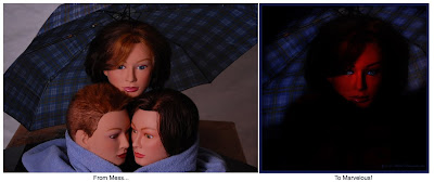
From Mess to Marvelous!


Click the Pic for a Bigger, Better Look!

Michelangelo, the famous Italian sculptor said, “I saw the angel in the marble and carved until I set him free.”

Perhaps as modern photographers we could find a similar expression in, "I saw the angel in the digital image file and Photoshop'd until I set her free." Not nearly as poetic as Michelangelo, but I think appropriate.

Here's just one more, I promise that will be all the culture for today...He also said, “Every block of stone has a statue inside it and it is the task of the sculptor to discover it.”

I think this is true of our photographs too. Using Photoshop as our chisel, we should be able to manipulate and form just about every image into something of beauty. After all, we must have seen something of beauty in the photo or else why would we have taken it in the first place? Just because we couldn't fully capture the maximum beauty with our camera and lights, doesn't mean the beauty's not there. We just need to work it a bit with our Photoshop tools.

With enough cropping, creative use of filter, brush, and adjustment layers we should be able to release the beauty.

I've attached a recent example that shows this. On the left above, is the mess I started with. I began shooting with only a vague concept of what I wanted. Actually, the theme was something blue. Blue umbrella, blue towel, blue eyes on the top center model.

After about 25 -30 shots of different poses and lighting, I really wasn't "feeling it" so I quit shooting for the night.

I opened the photos to preview and chose this one to Photoshop and began work to "reveal" the beauty trapped within.

Here are the steps and tools I used to go from mess to marvelous...

1. Heavy Gaussian Blur to hide the table and white backgrounds, layer mask to un-blur the face and umbrella.
Not enough, so I went to....
2. Filter - Render - Lighting Effects - Omni to center light on the top model and blacken out surroundings.
Good, but the skin tone of the mannequin is too flat, needs texture
3. Filter - Distort - Ocean Ripple, not bad, but needs more texture still
4. On a copy of the original layer, Filter - Distort - Glass, blend mode to overlay above the Ocean Ripple.
5. Looks good, but needs more intense colors, so on a copy of the Glass layer, Filter - Blur - Gaussian Blur, mid range, then change the blend mode to overlay so it doesn't blur - it just intensifies the color, and reduce to 50% opacity, to tone done the color just a bit.
6. Finally, a bit of playing around with different crops, and...
7. a 50% gray adjustment layer to selectively darken and lighten areas

There were probably 5-10 other good photos I left in that image. I could release them with different cropping and PS tools centered on other areas, but the umbrella, the glass filters that give it a wet look, and her "blue" expression all seemed to work together for this image.

So don't be too quick to give up on your images because they're not exactly what you had hoped for when you held the camera. You've got  a lot of power tools in Photoshop. Much easier than a hammer and chisel.

Release the beauty within! Turn your mess into marvelous!